"TEMPERA IS MY LOVE." REVIEW, DEMO & MASTER ARTIST SET
Ekaterina Neshkova
Impressionist artist, @neshkovaart

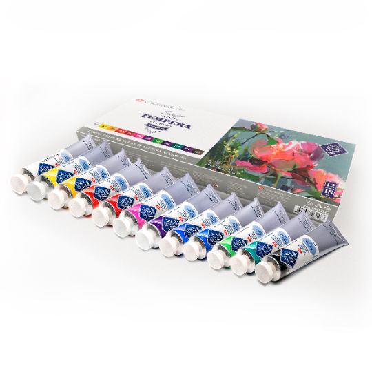
The paint is easily and quickly applied to the surface of the painting. The main difference from acrylic is the consistency of the paint and the feeling when working with it. Thick consistency, very close to oil paints. Unlike acrylic, tempera does not form a film on the surface of the picture, it dries evenly and quickly, the layers do not mix with each other. This characteristic of Tempera ensures the purity of the colour.
Colours mixes can be easily stored in tightly closed jars for at least a month. Tempera is a covering paint, but if you add water to it, it becomes more transparent and looks like watercolour. Tempera is perfectly mixed with watercolours and gouache. I would use oil paints, but this is a long-term technique, with the use of many additional materials, in compliance with strict rules and restrictions in the work. Oil painting is long, while tempera is crazy, fast, emotional and impulsive. Tempera is velvety, it is matte, it is my love».
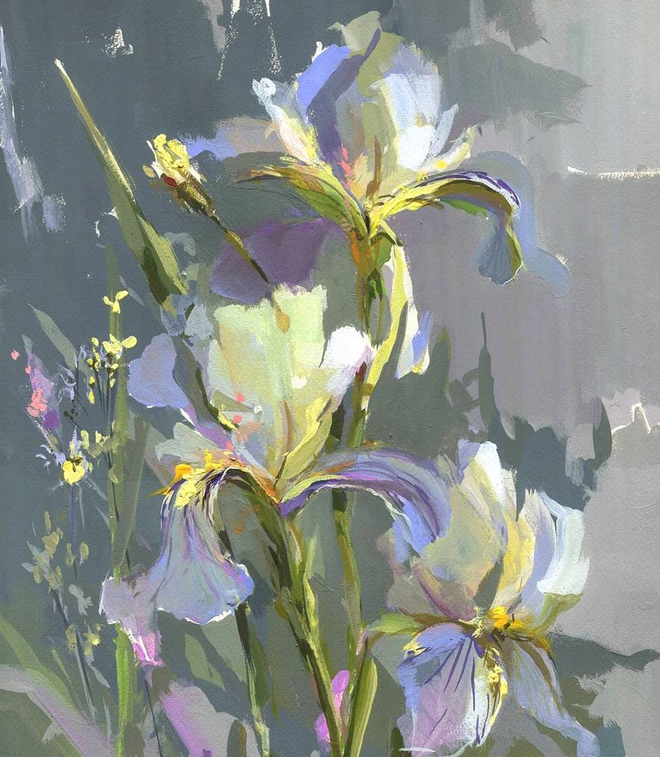
PURPLE IRISES
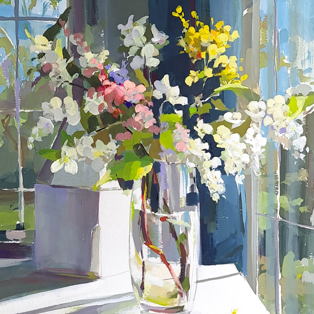
BOUQUET WITH YELLOW FLOWERS
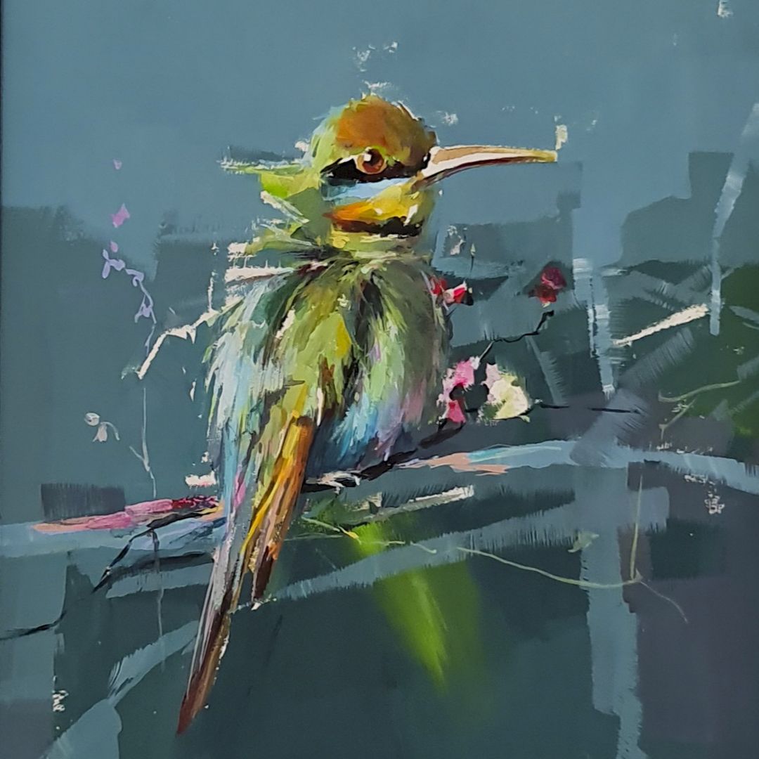
The bird
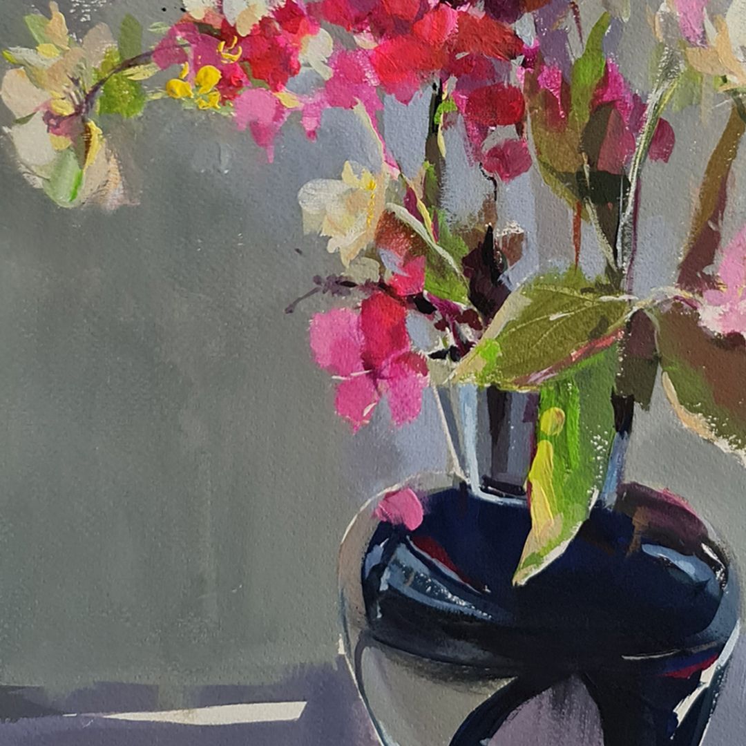
STILL LIFE WITH PINK FLOWERS
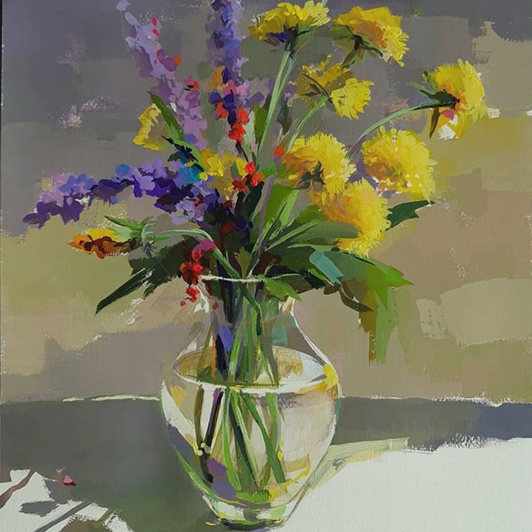
DANDELIONS
Ekaterina Neshkova, May, 2021