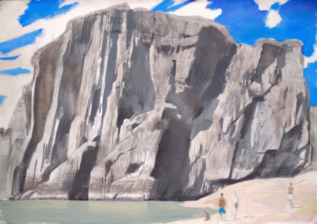
ILYA KOZLOV. TEMPERA LANDSCAPE "ROCKS OF CHEMAL".
ILYA KOZLOV. TEMPERA LANDSCAPE "ROCKS OF CHEMAL".


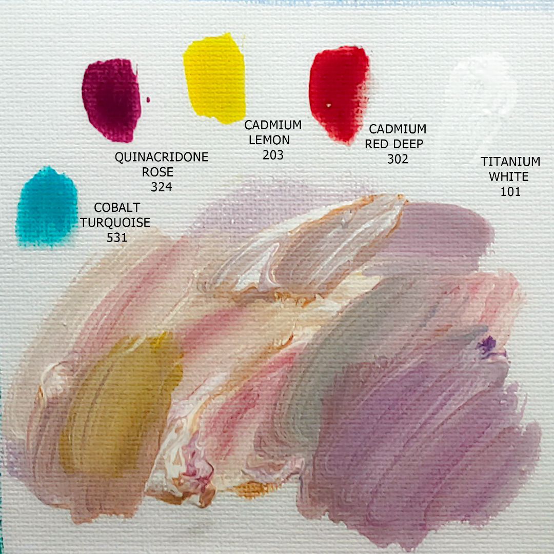
1. 101. Titanium white (P.W.6 *** ■), 2. 203. Cadmium lemon (P.Y.35 *** ■), 3. 206. Ochre light (P.T.42, P.W.6 *** ■), 4. 302. Cadmium red deep (P.R.108 *** ■), 4. 324. Quinacridone rose (P.R.122 *** ■), 5. 503. Ceruleum blue hue (P.B.15:3, P.W.6 *** ■), 6. 511. Ultramarine (P.B.29 *** ■), 7. 531. Cobalt turquoise (P.B.28 *** ■).

sky

rock

lake
sandy beach
The main task for me is to draw a portrait of a rock in which it is important to catch the right proportions, convey the mood, reflect the variety of shades of grey, and also work with the texture. I don't strive for hyperrealism, I'm closer to impressionism, which gives me the opportunity to find, amplify and convey in colour what seems to me very important and miss minor details. The rock is very textured, with various shape transitions that are accentuated by a stream of bright sunlight playing on the faces of the rocky rock and forming a variety of grey shades of its own and falling shadows. A colour-rich blue sky with graphic, bright white clouds complements the plot dynamics.
FIRST STAGE. UNDERPAINTING.
I start with a preliminary brush drawing. I take Ultramarine (511), draft a drawing and make a tonal underpainting, carefully transferring the proportions of the rock, the ratio of light and shadows from the sketch to the canvas. The rock consists of several main protrusions and faults, it is important to convey the diagonal movement of their lines correctly and lay the main shadows in tone. Ultramarine is my favourite pre-drawing colour, with a rich blue with a red tint. The lines drawn by it at the beginning become part of the finished work: I do not paint them to the end, they shine through in some places, emphasizing colour accents.
Tempera can work both liquid and pasty, increasing the amount of water in the paint, obtaining a more liquid consistency, while the colour remains equally bright and saturated. Earlier, I often worked with oil, but, unfortunately, I began to have allergies, and I was looking for an alternative to oil paints and settled on tempera, because it does not cause allergies in me, is as close as possible in consistency, opacity and finish coating characteristics to oil, only dries much faster and almost does not smell at all. Tempera’a drying speed is the same as any other water-based paint: it dries as the water evaporates, it doesn't bother me. At the first stage, I try to work in liquid so that the paint is docile, like watercolours. It is easier to paint the canvas with liquid paint. In the future, I will work more pasteously, creating the texture of the rock with thick strokes.


Second stage. Clarification.
After finishing the preliminary drawing and designating the main shadows, I move on to the second stage of the underpainting: I cover the entire plane of the canvas with colour, constantly refining the drawing and working on the details.
First of all, I add warm shades to the shadows. To do this, I add Ochre light, Cadmium red deep or Quinacridone rose to Ultramarine, getting complex muted shades of varying degrees of heat and cold. I apply them on top of the first layer, making the shadows denser and deeper. As I move on to the illuminated rock fragments, I paint over the white canvas with a liquid mixture of Ochre light (206) + Cadmium red deep (303) paints, producing a transparent, colourful layer that retains the glow of the white canvas. Next, gradually, where necessary, I apply thick layers of paint, without adding water, adjusting the pattern and refining the silhouettes with paste strokes, forming the texture of the rock, adding Titanium white (101), Cadmium lemon (203) or Cobalt turquoise (531) in the mixture.


Moving to the surface of the water under the rock, I take the main colour - Cobalt turquoise (531), since the water has a soft turquoise hue. From my angle, it has little noticeable reflections of rock and sky, so I add Ochre light (206), getting a slightly muted warmer rock colour reflected in the water, or Quinacridone rose (324), getting a muted cold shade of sky. The mixture of Cobalt turquoise (531) + Cadmium lemon (203) colours will enhance the turquoise color of the water with a brighter green colour, you just need it a little. Also, I add Titanium white (101) to the blends, where I want a lighter shade.
For the sand beach, I take the main blend of Cadmium lemon (203) + Cadmium red deep (303) + Titanium white (101) flowers, getting a soft sand tint. Adding Cobalt turquoise (531) or Quinacridone rose (324), I get intricate, colder shades to reflect the slightly visible shadows from the bumps of the beach surface.
The main colour of the sky is Ultramarine (511), and in general, it was almost ready at the underpainting stage, I only refined it a little while painting the work, adding Cobalt turquoise (531) for azure and Titanium white (101) for clouds, adding a little Ochre light (206) for volume, where necessary. At the end, I adjust the shape of the clouds a little more, using clean, very sheltering Titanium white (101), which retain the shape of a smear, because I want to convey the texture and movement of snow-white clouds across the bright blue sky.


Stage three. Final.
At the final stage, I once again go through the brush throughout the work, strengthening the details or vice versa, taking something to the background. It is important for me to get a whole harmonious work, consonant with my inner sensations from what I saw in a living landscape, I will be convinced that as a result this is exactly what I wanted to convey on canvas.

