Mikhail Evlakov. Autumn Winter landscape. Texture in tempera painting


About Tempera PVA and surfaces
I work in various techniques and with different materials, but most of all I love tempera. I like the consistency of the paint, the opacity and richness of the colours. I like that it is completely unpretentious when you use it: there is no need for long preparations, no solvents are needed. Paper, paints, brushes and water - everything is simple and quick. The paint dries quickly, unlike oil, and the coating is elastic and durable, like oil. This is very convenient in the open air and when travelling.
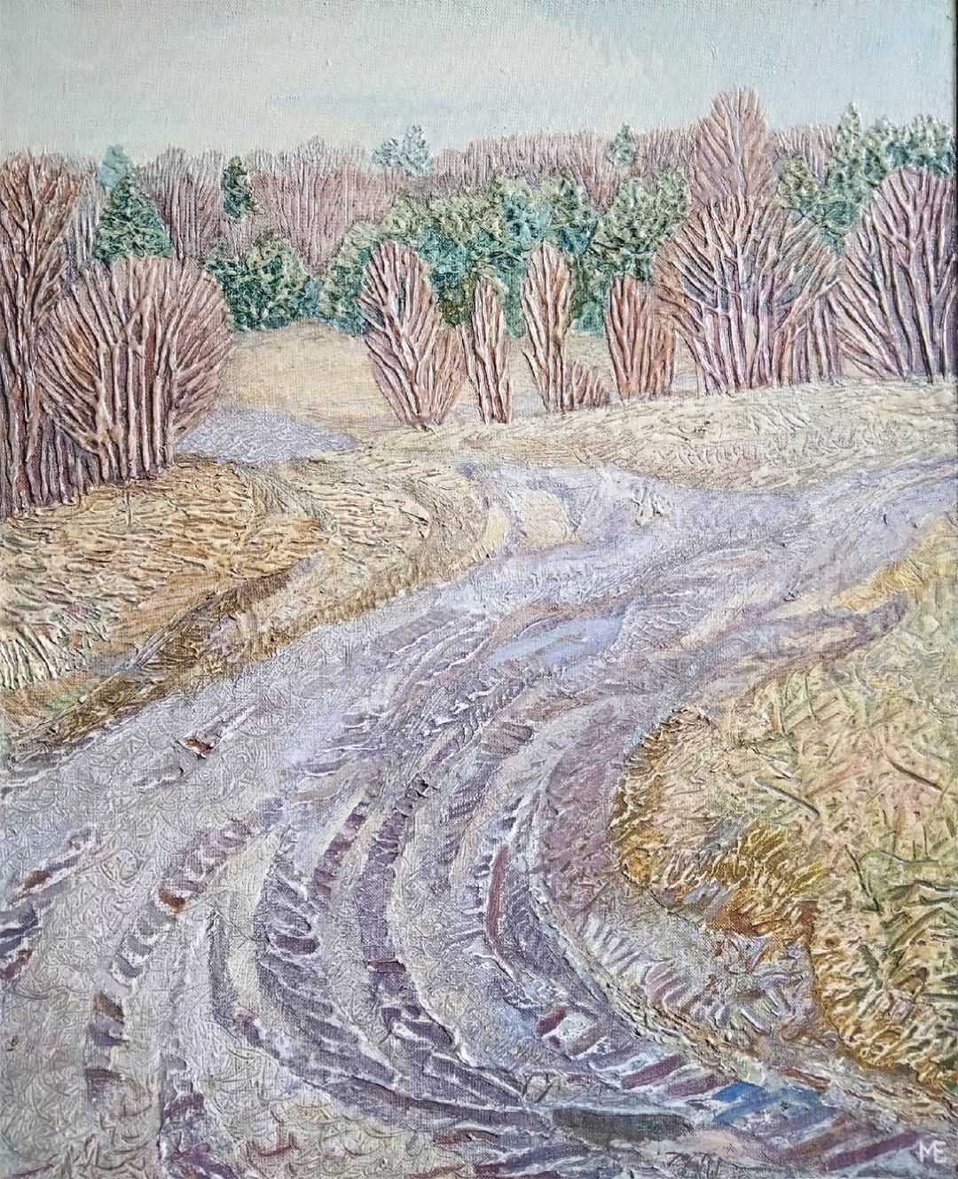
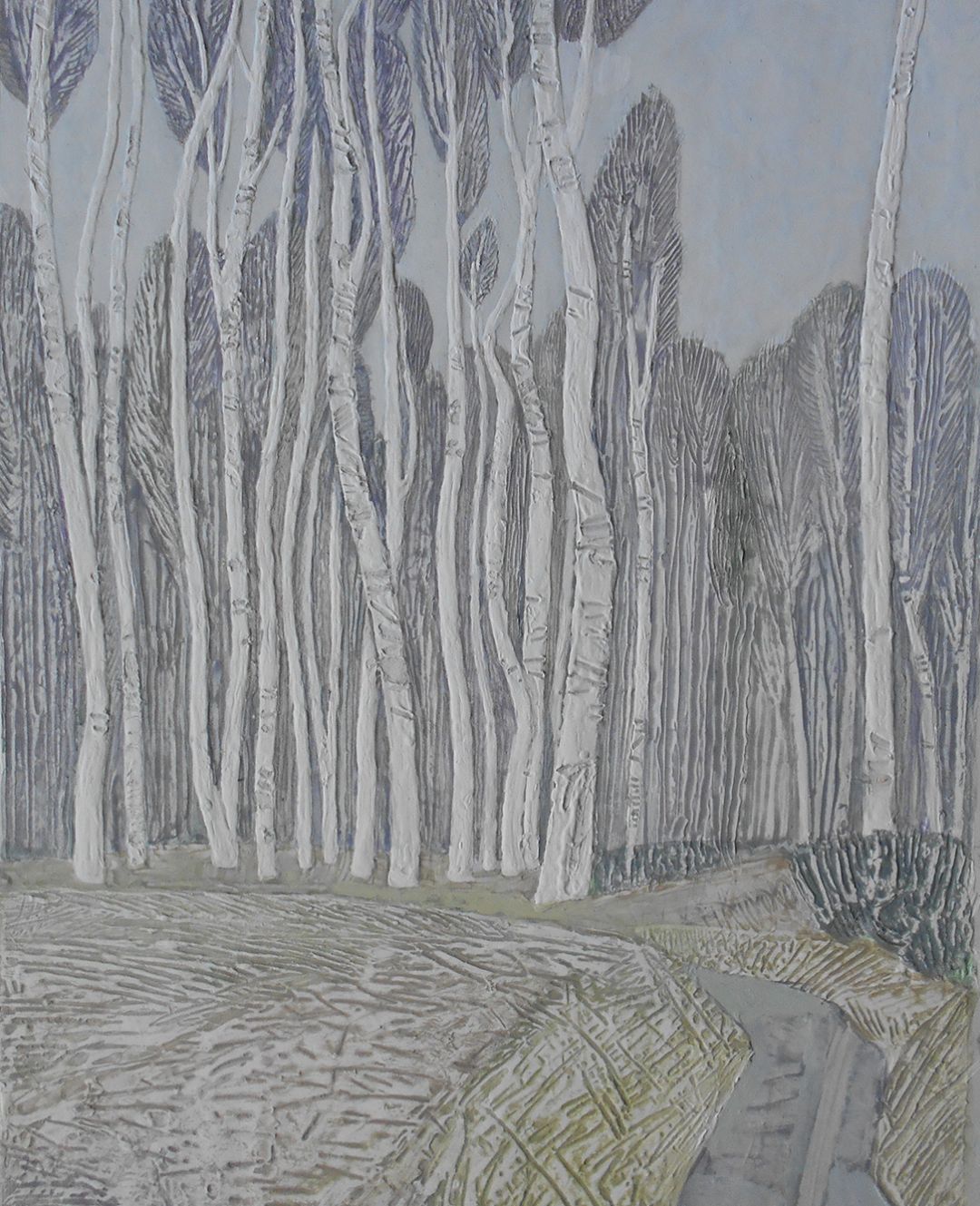
Most often I work on thick paper. This can be simply a sheet or a sheet pre-stretched on a wooden pad. To do this, I thoroughly wet the sheet with water, dip it directly into the water and keep it there for 1-2 minutes, then place the sheet on the table, face down, and place the pad in the middle of the sheet, so that 5-7 cm of paper remains on each side. Next, I begin to bend the ends of the sheet around the perimeter of the pad. Next, I attach the ends of the paper around the entire perimeter to the pad using a stapler, push pins or PVA glue. It's always better to start from the corners - this way there will be no wrinkles. I place the stretched tablet against the wall and wait for the paper to dry, which usually takes 2-3 hours. The paper dried on a pad in work is very similar to a well-stretched canvas, only without the texture of the canvas, of course. It is pleasant to work on, the surface is smooth and does not deform from water and paint, like a regular sheet. When the work is ready and the paint surface has dried, I cut it off the pad and stretch a new sheet.
AUTUMN WINTER LANDSCAPE DEMO
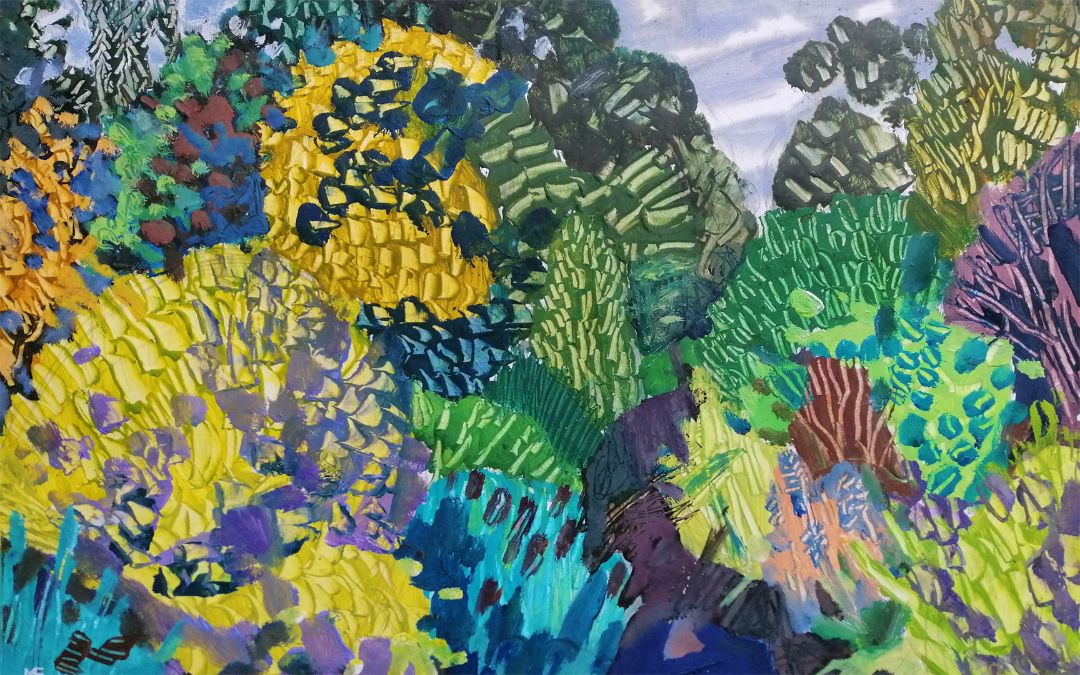
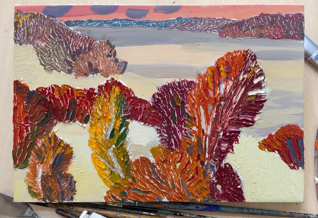
Today I will be working on an autumn landscape. The plot of the landscape is that turning point in nature when winter gives way to autumn. The bright, yellow-red leaves on the trees are still burning, but snow has already fallen. And everything froze. This condition will not last long, usually a day or two and the leaves will finally fall and real winter will begin.
Working with textures
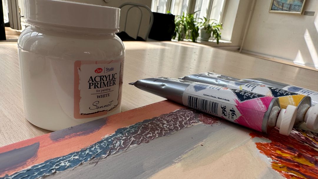
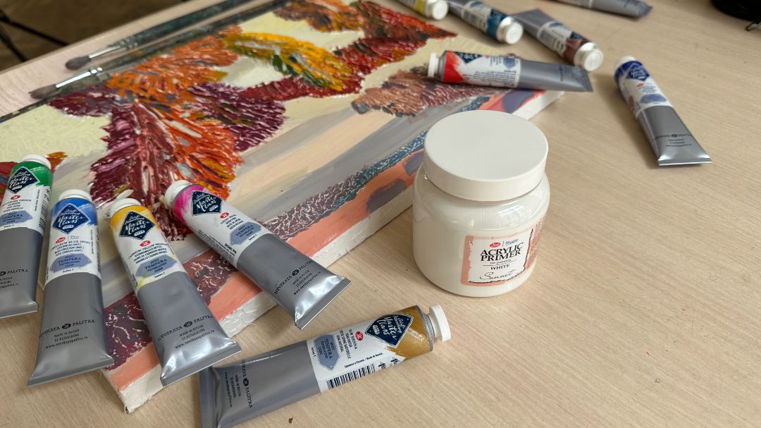
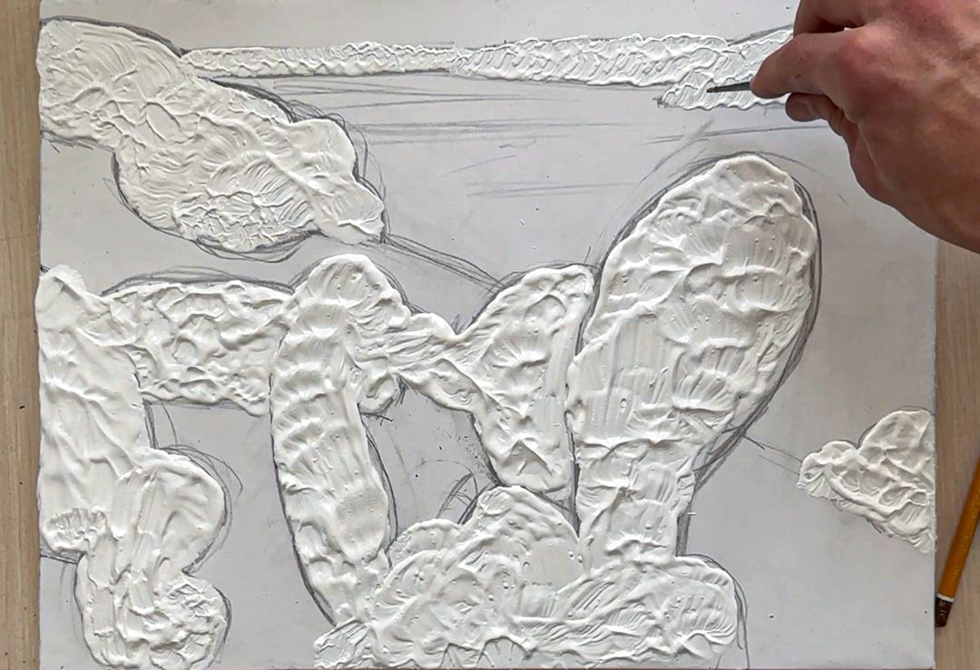
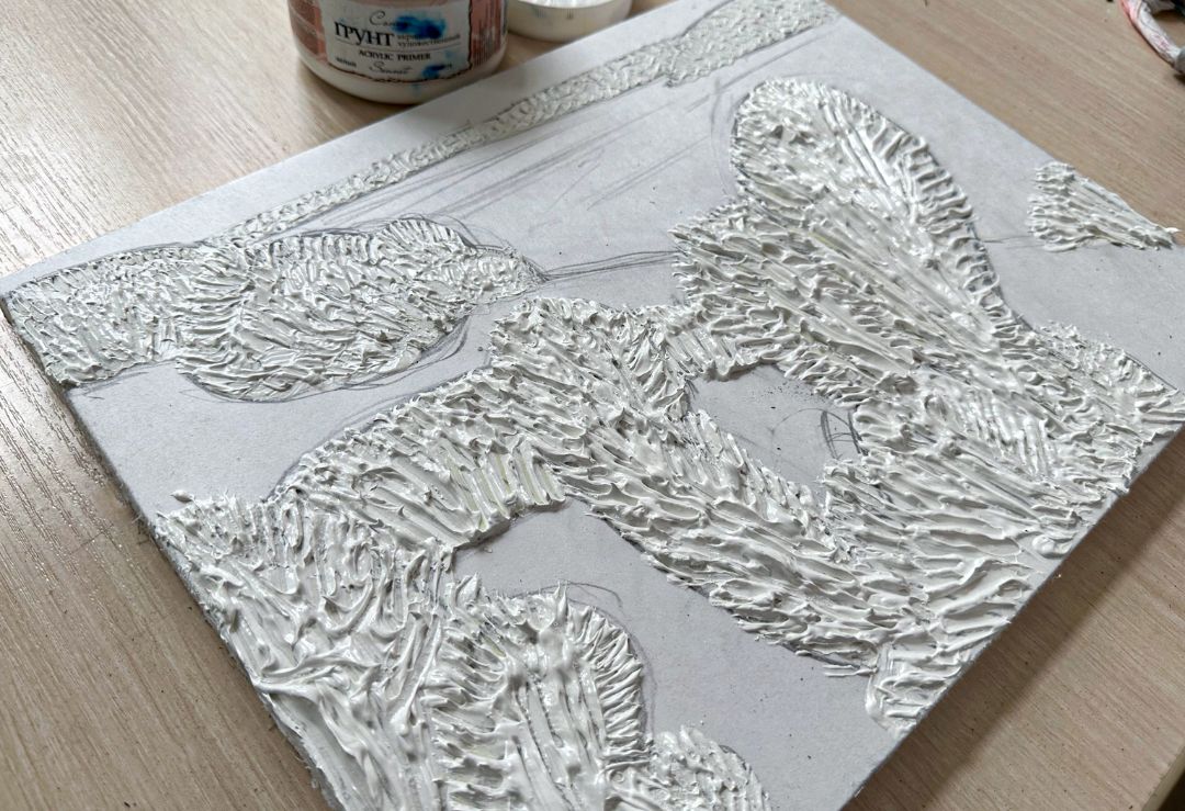
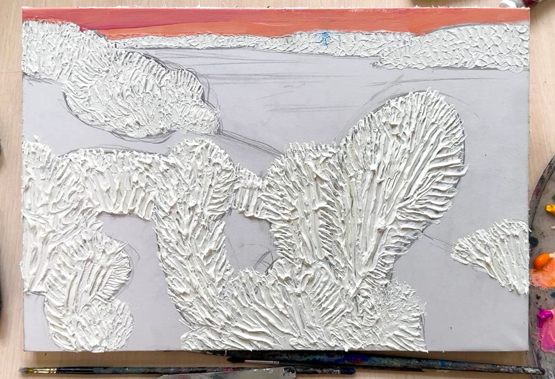
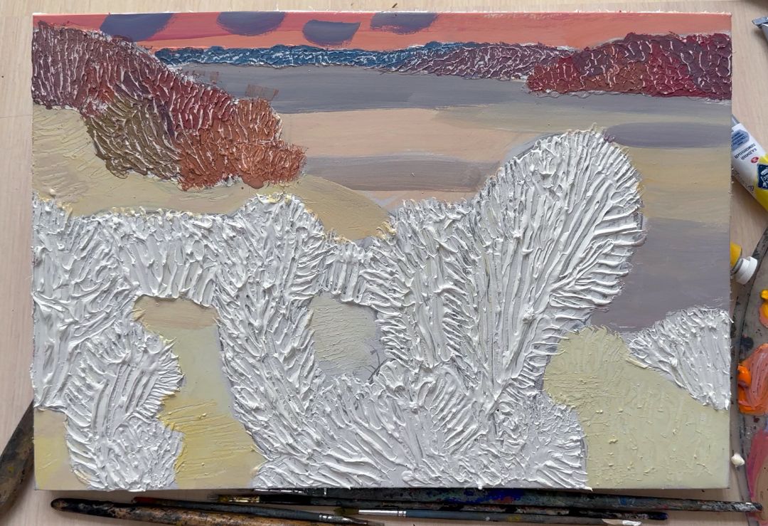
I like to work with texture, for this I will use acrylic primer - it is universal. Initially, I only used it to prime canvases, preparing the surface for painting with tempera or oil. But somehow, in the open air, while working on a landscape, I wanted to add textures, but I only had primer at hand, I started working with it and it worked out for me, I liked it, and since then I’ve been using it often. Today I will do the drawing, apply primer and create textures, and tomorrow I will start painting. It is necessary to give the primer time to dry on the surface of the paper. First of all, I work with a pencil, mark the sheet, create a composition of the landscape, designate the main objects: the horizon line, the contours of trees and bushes, the lines of hills. Having finished with the drawing, I proceed to textures: I apply primer with a brush, forming the textures of objects
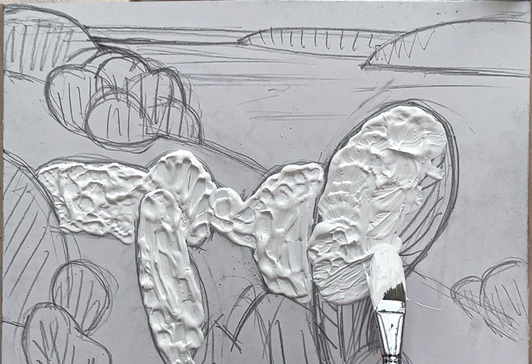
In the foreground, the texture is most voluminous and expressive, so I apply more primer to make the texture more expressive. I work with a hard bristle brush, the bristles of which help me create an interesting and expressive texture. During work, the soil dries out a little, becoming thicker and this makes the relief even more interesting. The soil is much more mobile and elastic than texture pastes, which is why I love it. On distant objects I use less ground: the texture should be less voluminous so that it does not clash with foreground objects.
After I've primed all the objects, I work on the textures. I start from the background. Using a palette knife I create the texture of the trees and bushes, trying to make it rhythmic and interesting. Before moving on to the foreground textures, I wait about half an hour for the previously applied primer to dry and thicken a little, then the texture will be clearer. Also, with a palette knife, I create the relief of the trunks, the lines of the branches and the outlines of the foliage in the foreground. Having finished with the primer, I leave the work to dry until tomorrow.
Working with coloUr
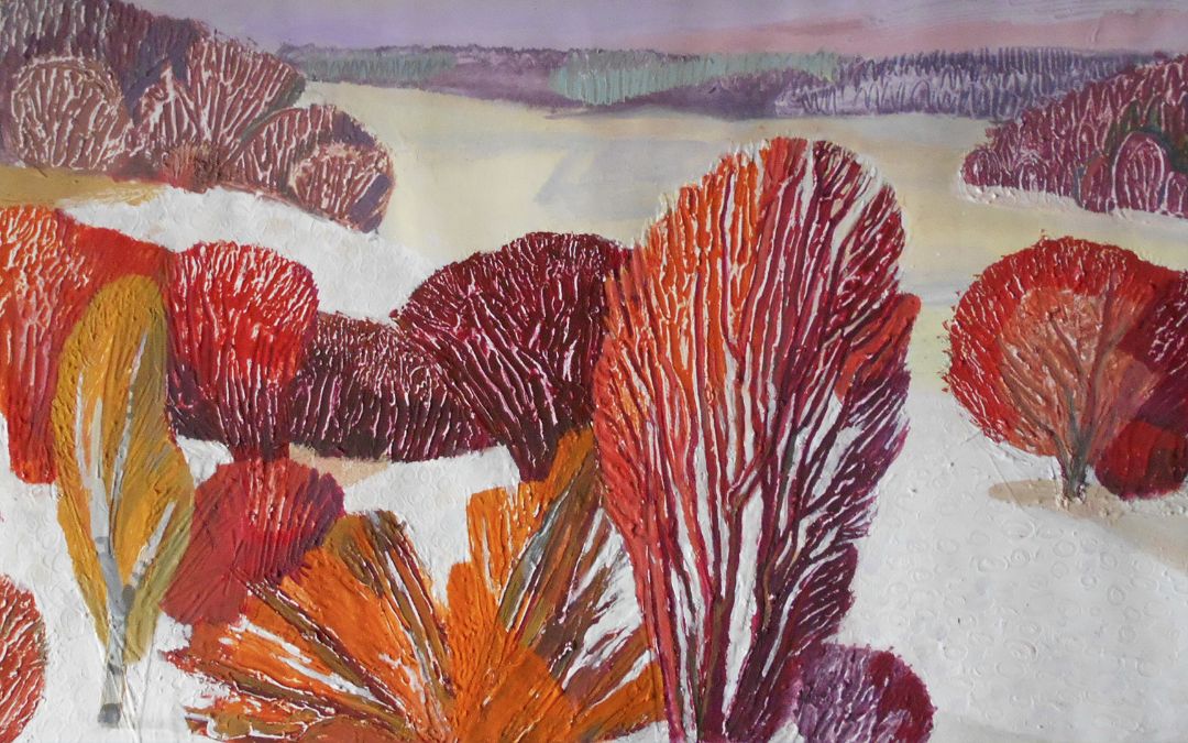
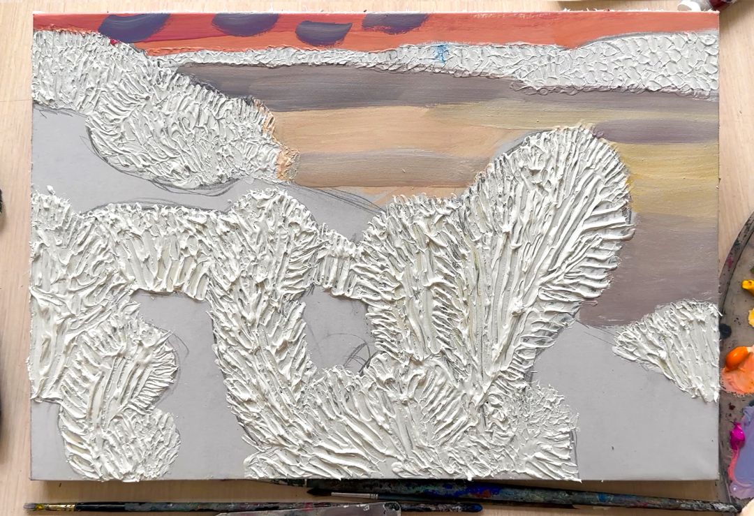
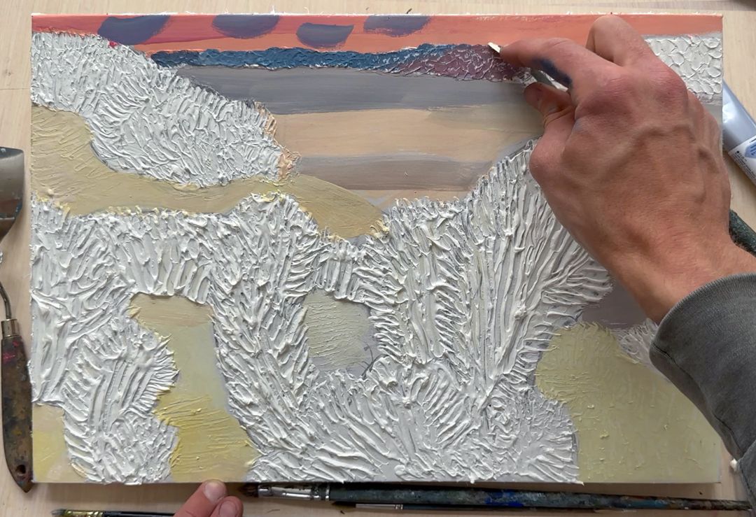
First, I create a general background by covering all the white pieces of paper with colour. The background consists of fragments of the sky and a field covered with the first snow. The sun is about to set, so the sky has turned orange and pink and the snow looks a muted golden yellow.
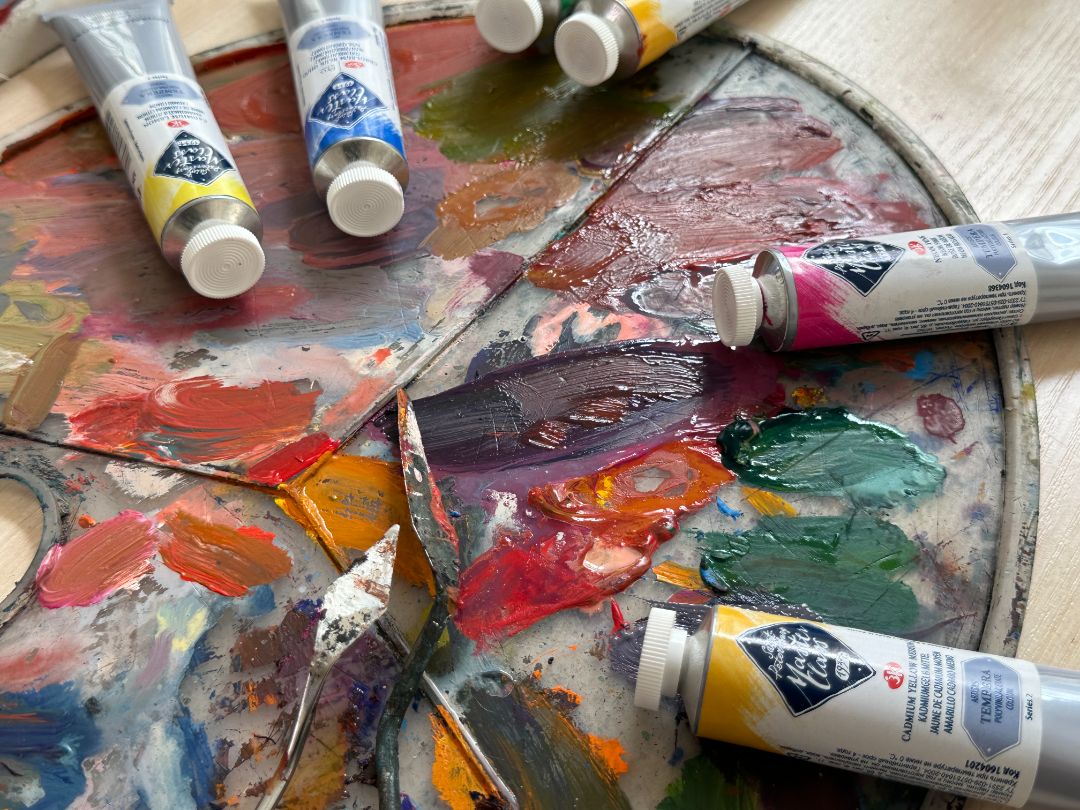
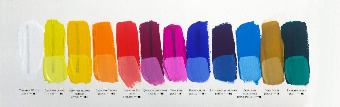
The palette of the landscape:
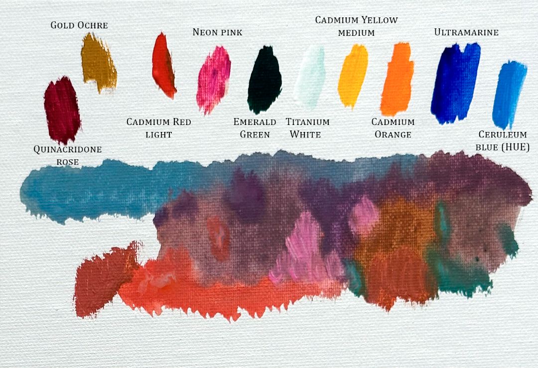
1. Titanium white (P.W.6 *** ■), 2. Cadmium lemon (P.Y.35 *** ■), 3. Cadmium yellow medium (P.Y.35 *** ■), 4. Cadmium orange (P.O.20 *** ■), 5. Cadmium red light (P.R.108 ***■), 6. Neon pink (P.V.1 * ◨), 7. Quinacridone rose (P.R.122 ***■), 8. Ultramarine (P.B.29 *** ■), 9. Phthalocyanine blue (P.B.15 *** ■), 10. Ceruleum blue (HUE) (P.W.6 P.B.15:1 ***■), 11. Gold ochre (P.Y.42 *** ◨), 12. Emerald green (P.G.7 *** ■).
sky
snow
trees in the foreground
forest in the background
First, I create a general background by covering all the white pieces of paper with colour. The background consists of fragments of the sky and a field covered with the first snow. The sun is about to set, so the sky has turned orange and pink and the snow looks a muted golden yellow.
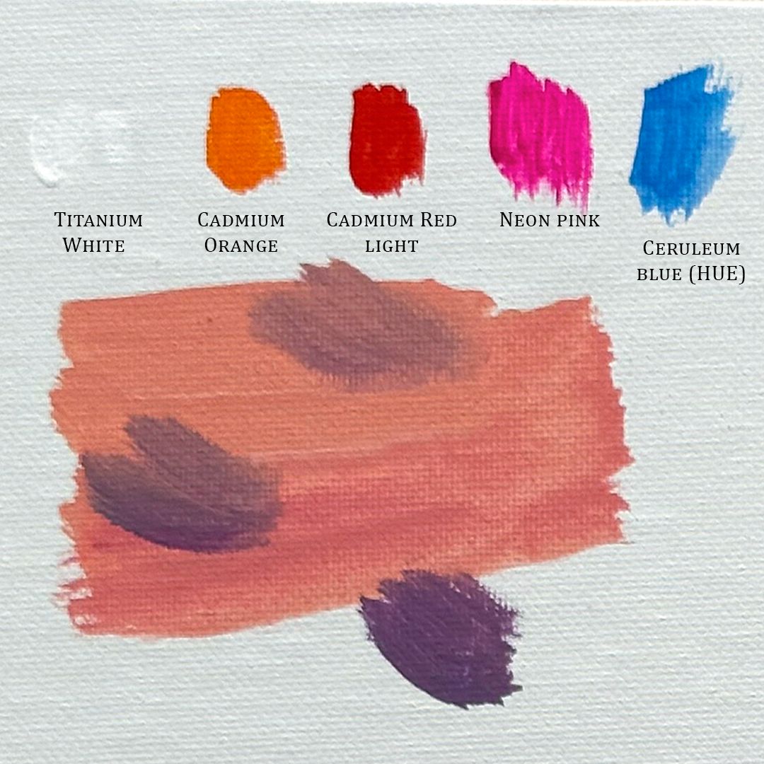
For sky I take mixtures of colours: Titanium white (P.W.6 *** ■), Cadmium orange (P.O.20 *** ■), Cadmium red light (P.R.108 ***■), Neon pink (P.V.1 * ◨), Ceruleum blue (HUE) (P.W.6 P.B.15:1 ***■).
For snow: Titanium white (P.W.6 *** ■), Ceruleum blue (HUE) (P.W.6 P.B.15:1 ***■), Quinacridone rose (P.R.122 ***■), Cadmium lemon (P.Y.35 *** ■), Cadmium yellow medium (P.Y.35 *** ■), Cadmium orange (P.O.20 *** ■).
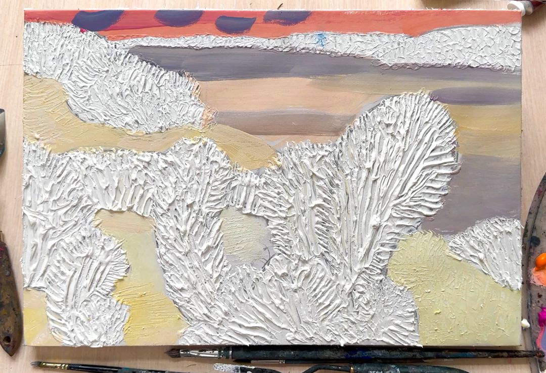
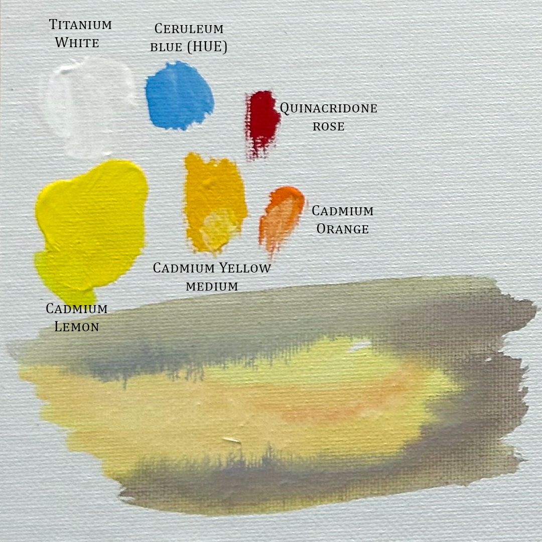
Next, I move on to painting on textured areas. I'll start with the forest in the background. The forest stretches as a dark stripe near the horizon. The leaves on the trees have not yet fallen, and bright autumn crowns are visible. But the further you go, the more neutral and cold the colour becomes, turning into a muted cold grey shade.
For forest in the background I take the mixtures of colours: Titanium white (P.W.6 *** ■), Cadmium yellow medium (P.Y.35 *** ■), Cadmium orange (P.O.20 *** ■), Cadmium red light (P.R.108 ***■), Neon pink (P.V.1 * ◨), Quinacridone rose (P.R.122 ***■), Ultramarine (P.B.29 *** ■), Ceruleum blue (HUE) (P.W.6 P.B.15:1 ***■).
Having finished with the colour, I take a palette knife and remove the paint a little with the end so that the white pattern of the frozen soil appears. The paint has already dried, but has not yet had time to dry completely, so it is easily removed and a subtle pattern appears, setting a unique rhythm and forming details that are interesting to look at.
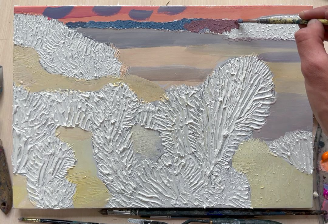
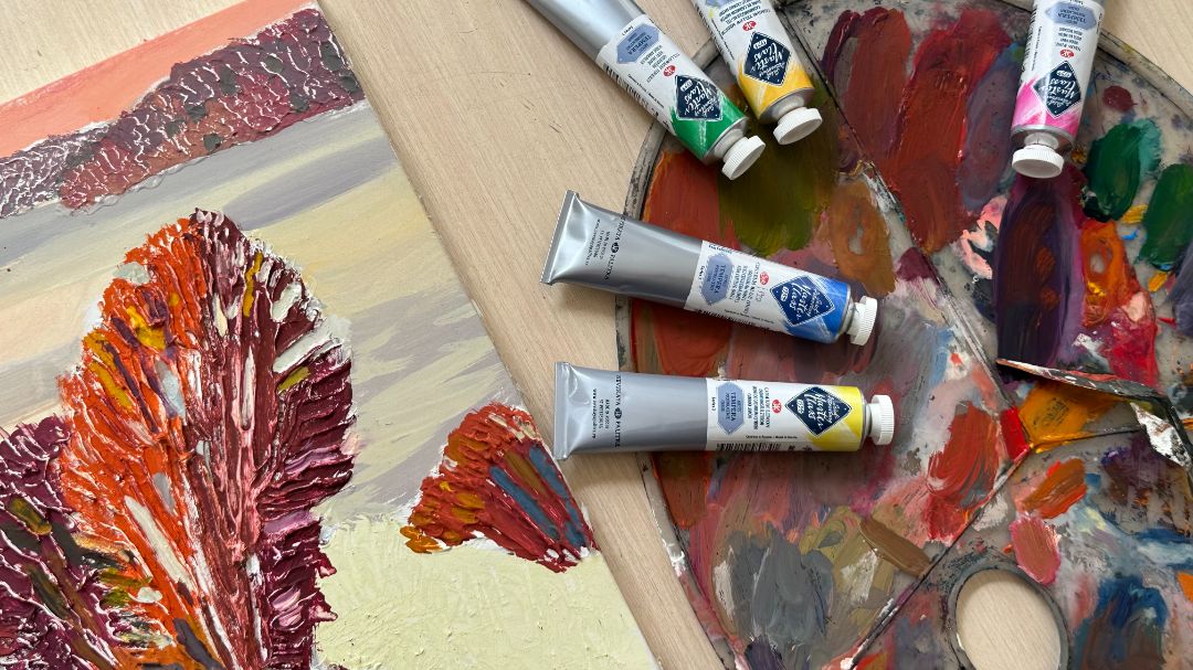
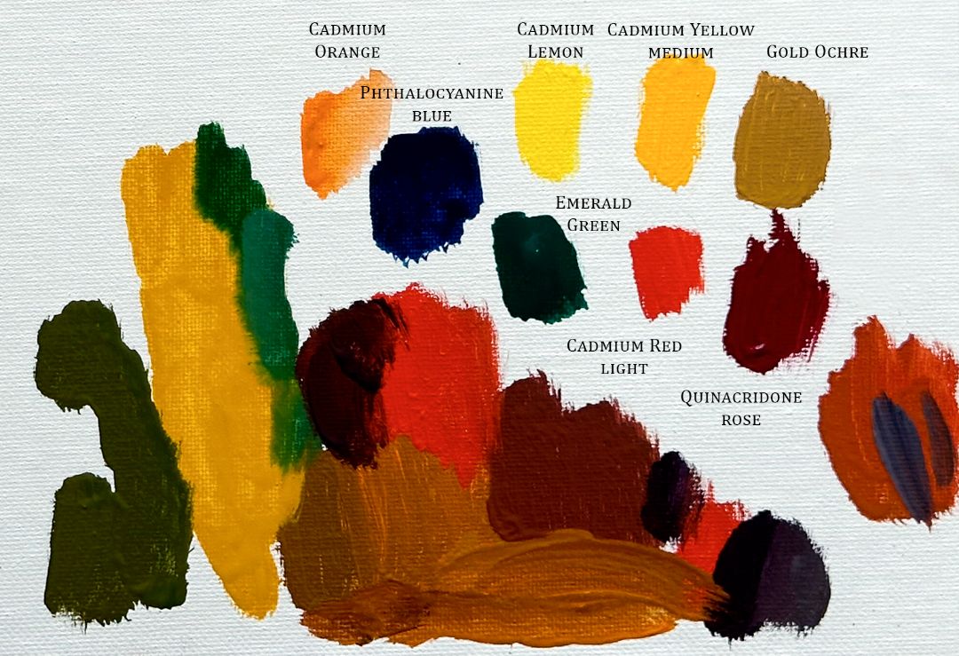
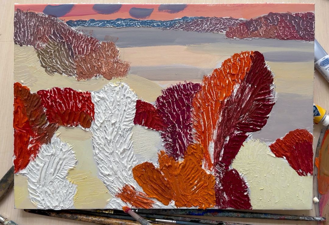
Next, I move on to the trees and bushes in the foreground. The colour of the leaves here is more saturated and bright than in the background. The texture is more pronounced.
For trees in the foreground I take the mixtures of colours: Cadmium lemon (P.Y.35 *** ■), Cadmium yellow medium (P.Y.35 *** ■), Cadmium orange (P.O.20 *** ■), Cadmium red light (P.R.108 ***■), Quinacridone rose (P.R.122 ***■), Phthalocyanine blue (P.B.15 *** ■), Emerald green (P.G.7 *** ■), Gold ochre (P.Y.42 *** ◨).
The main foreground colour palette is orange, yellow and red. I use blue and green shades for shadows. I boldly apply a rich, bright colour to the illuminated areas and after a couple of minutes, I remove it with a palette knife from the upper boundaries of the soil. The paint remains in the recesses, and a white pattern from the ground appears on the surface, enhancing the feeling of relief. It is important that the paint does not have time to dry completely, otherwise it will be very difficult to remove, so I alternate working with a brush and a palette knife. Having identified the main colour spots, I move on to shadows and details. Where I don't like how the ground shows through, I use white. I enhance the shadows in the crowns, adding more cool reds, blues and greens.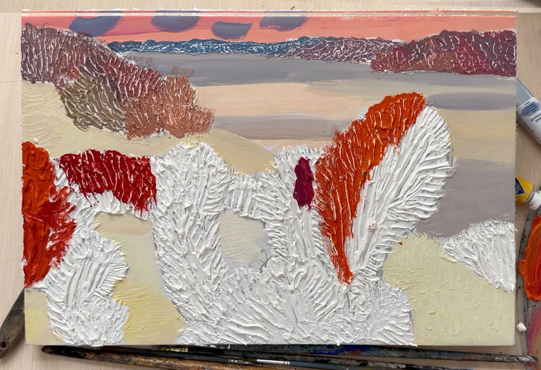
You can refine details for a very long time, and I like it, this is why I especially love tempera. You can always fix something. If you can’t do painting all the time, then you can work as much as you have time and leave it, and then return to work when you have time again. This means that you can endlessly continue the same work correcting something or when you decide that you have finished. The next day after completion, the work can be varnished. I love matte varnish. After coating, the colours look richer and the tones are deeper.