VYACHESLAV KOROLENKOV'S STORY ABOUT PAINTING
AND 10-MINUTE TEMPERA SKETCHES, DEMONSTRATIONS AND TIPS.

WHAT ARE TEMPERA SKETCHES CREATED FOR? HOW AND WHERE IT HAPPENS?

There are groups, you can find them in any city, where artists get together, paint and engage models. It is always very interesting and we can see it in two ways: as a regular practice, a regular study of the life, we can also consider every sketch to be a masterpiece. For me, it is a challenge to create the painting. To underline the human’s beauty, catch the movements of the lines, it is something amazing, when you are close to constantly changing miracle, revealing the plastic and incredible beauty of the woman’s body, but it is absolutely wonderful to paint the men, too. Those, who come to such sessions understand this. They don’t ask why they need this. They’re just enjoying the process, the life, they’re experiencing the joy that they see the life and the divine beauty of the human. I’m sure, there is nothing more beautiful than a human exists. They are not just the lines created on the canvas or paper, it’s the entire life of the artist in every sheet, it’s his soul. Why do I practice pictorial sketches of a nude model? Because it’s difficult, when you have learnt to depict a nude model in any poses, you are able to paint anything.


THE SIZE OF TEMPERA SKETCH.

I usually use 30х40 cm or square 40х40 cm which is also very good, but I sometimes use different sizes, for cases, when a model took a very interesting pose, and the usual sizes of the paper don’t allow me to depict the composition I want, for example, the narrow vertical or horizontal formats of 20х40 cm.

PAINTING. PLAIN-AIR OR STUDIO?

I got a feeling that when someone asks such a question, they want to emphasize that the work on the plain-air gives the painting specific advantages. I agree that plain-air is some sort of medium where you acutely perceive the life and transfer this feeling, the impression of this very state. Later, in the studio, you can refine this state using this impression. The main thing that plain-air gives is the opportunity to plunge into this state, get emotions and reflect them in the work. We all understand, of course, that the state in the nature has gone, but we always paint our perception of the environment around us, our impressions and feelings, even on the plain-air. I wanted to emphasize this, we just peek over nature, it is the reason for us to pull out of ourselves the poetry of painting, to make it pour out of us. We don’t create a painting, during the process you understand what you have to do this very moment. This happens naturally, as breathing, as heartbeat.

Many times I’ve observed something really incredible. The subject of the painting is seemingly simple, why not just to copy and repaint it as it is? The artist though plunge into it, becomes the part of it, reflects their inner feeling, some magic occurs at the point of the brush, a miracle. The artist creates something unique, the reflection of their own perception, the only thing no one else has. Someone just copies it. The others create the mysterious depth they have no idea where it appears from.
Actually, there is no difference between plain-air and studio painting sessions. You can paint in the studio using a photo. Though, it is easier on the plain-air, in the nature. You become the part of this area, you don’t need to make any extra efforts to reproduce inside you the state that a camera can’t reflect. Painting process is not limited by the plain-air, painting process is a miracle, something that is subtle, the plain-air just helps to plunge into this miracle.


IT’S IMPORTANT TO STOP ON TIME.

What to do when you can’t stop on time, and the work that started amazingly, turns out to be clamped and worn out?
No matter what you do, there has to be moderate approach, in any case, you need to catch yourself and stop, when you gain a good result. The easiest way to learn this is to take pictures of steps of your work, at the time, when you feel that it is almost ready, but you still have a desire to finish it. Over time, you’ll learn to catch this moment when working and stop.

REALISM OR IMPRESSIONISM?

If to ask the same question about music, we can’t definitely tell what is better classics or modern music? No one can answer clearly, tastes differ, what inspires you or makes you feel relaxed, makes you think or helps to cope with something, find out who you are or cope with external circumstances. The same is with art styles. We can’t say, that the realist feels worse, whereas the impressionist feels better, that the realist is reserved, is focused on details and the laws of constructing forms and space, but the impressionist transfers their own emotions and impressions, having forgotten about everything else, but it’s not true. Both realism and impressionism are the tools to reflect the outlook of the artist. I think, the main point is not to fall into a trap of the style. No rigid limits set by words, it’s important to listen to yourself, not to try to limit the painting.

I’m against blind copying, meticulous and to every detail, but I have a great respect for any painting, I just find inspiration in other things. I recognize as kindred spirits those artists, who are able to generalize, are able to show something, are able to leave something behind.

The same fascinates me when I communicate with people. For instance, in communication, I prefer less words, but each word has its value, weight and beauty. I think, the love to life and desire to explore it are behind this. I’m convinced, that when this desire to learn and develop fades away it’s a signal to the universe that life is over. It’s pointless. There is nothing to be interested in, no motivation to develop. I have an infinite respect for the people who at the age of 80-90 took the brush for the first time, and who follow their desire to paint, develop, and learn how to do this all. With the help of the painting to learn how to show your vision to the world, your emotions and share them. To learn about composition and colour. How the mixing colour are exciting in one case, but has no such effect in another. 

The craving for a new day makes me paint new works. This leads to the state of happiness, when you paint or create a new composition. It is very interesting. All the painting, to my mind, is a mix of semi-tones, the skill to use semi-tones, even a quarter of these tones. They are always different. There is a lovely phrase by an impressionist, that he doesn’t paint the world the way it really is, and not the way he sees it, but the way he wants to see it.  

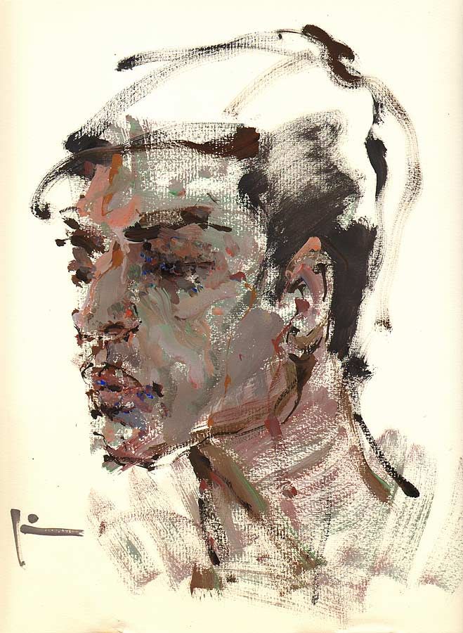
A DRAWING OR A PAINTING?

What is more important for a beginner, to practice in accuracy of a drawing or draw a sketch on condition, thus practicing the skills of working with colour and light. Sometimes it’s difficult to have everything, especially in the beginning, but both are important. The best way is to alternate. Trust your feelings, the approach of small steps also works. Start with small things, with simple forms and small sizes. Start with simple objects, for example, with a cup. When you succeed in constructing a form, move to colour, paint it. When you have drawn and paint the cup, add another object, a lemon, for instance. This way, step by step, you will acquire both skills.

CAN A SMALL SKETCH BE TRANSFERRED TO A BIG FORMAT?

Sometimes you really want to reproduce a small, but lovely sketch in a big format. Of course, if the sketch is tonally built or if the compositional balance in it is found, the sketch can be of any size. But I always fail just to transfer the sketch. Big format, as I think, requires more detailing, you need to increase the number of details. If you just enlarge and transfer the small sketch, then it won’t be the same. I’ve always wanted to take an enormous format, big brushes and initially work with big size, I find this more correct. I will definitely think about how to make this wish come true. Now technical moments stop me, but I think that everything is possible. 
DO YOU NEED TO LEAN IF YOU HAVE A TALENT?

Pictorial art is a very complex science. Talent helps to have an easy start, it pushes you to act, but, at a certain point, it is not enough to have only talent. Talent is a kind of advances for a good start. At some point, a dire need for basic knowledge and skills appears. Of course, it’s easier to get them from certain sources or by communicating with those, who have already acquired them. You need to be patient, hardworking, to learn, to understand and to master. You will have to draw the same thing numerous times until the result satisfies you completely, until you acquire full understanding of how to construct the form in space.A school, courses or works of your favourite master can become a source of knowledge, but it is important to acquire and master this knowledge. Then, there is a transition to your own intuition, you work out your own vision and technique.


The faster an inherently talented person learns how to draw, becomes familiar with paints and techniques, the earlier such person will fulfill their creative abilities as a painter and will be able to realize any idea and get satisfaction from process and result. When you are a perfect master of techniques like construction of any form, sculpting of space, it is much easier to remain true to yourself. You don’t need to waste time and strength on drawing, you can go straight to finding colour and space design. You can concentrate on discovering something new, share it with others, that is what matters. 

When you are a perfect master of techniques like construction of any form, sculpting of space, it is much easier to remain true to yourself. You don’t need to waste time and strength on drawing, you can go straight to finding colour and space design. You can concentrate on discovering something new, share it with others, that is what matters.

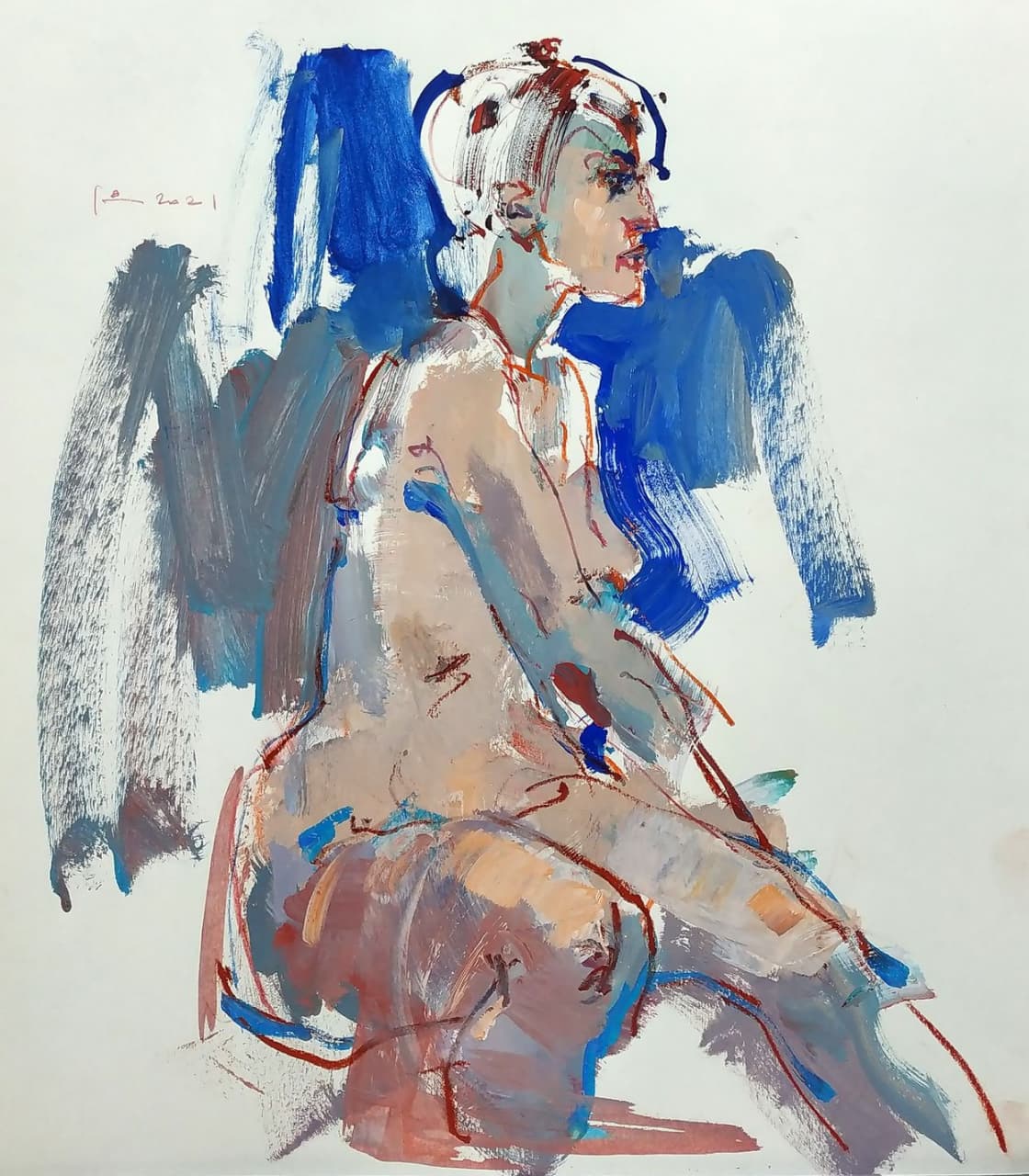
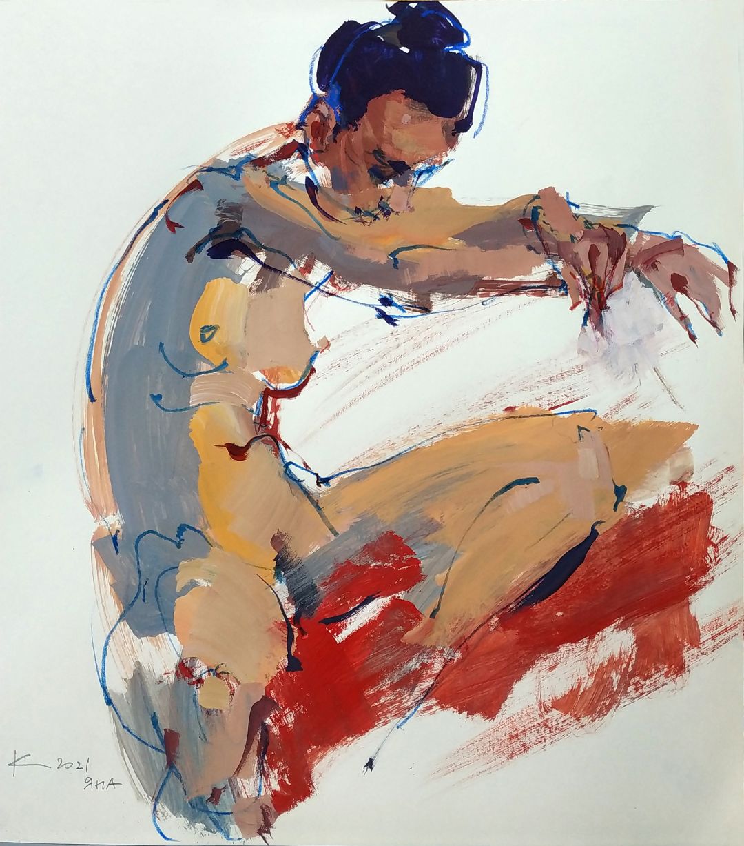
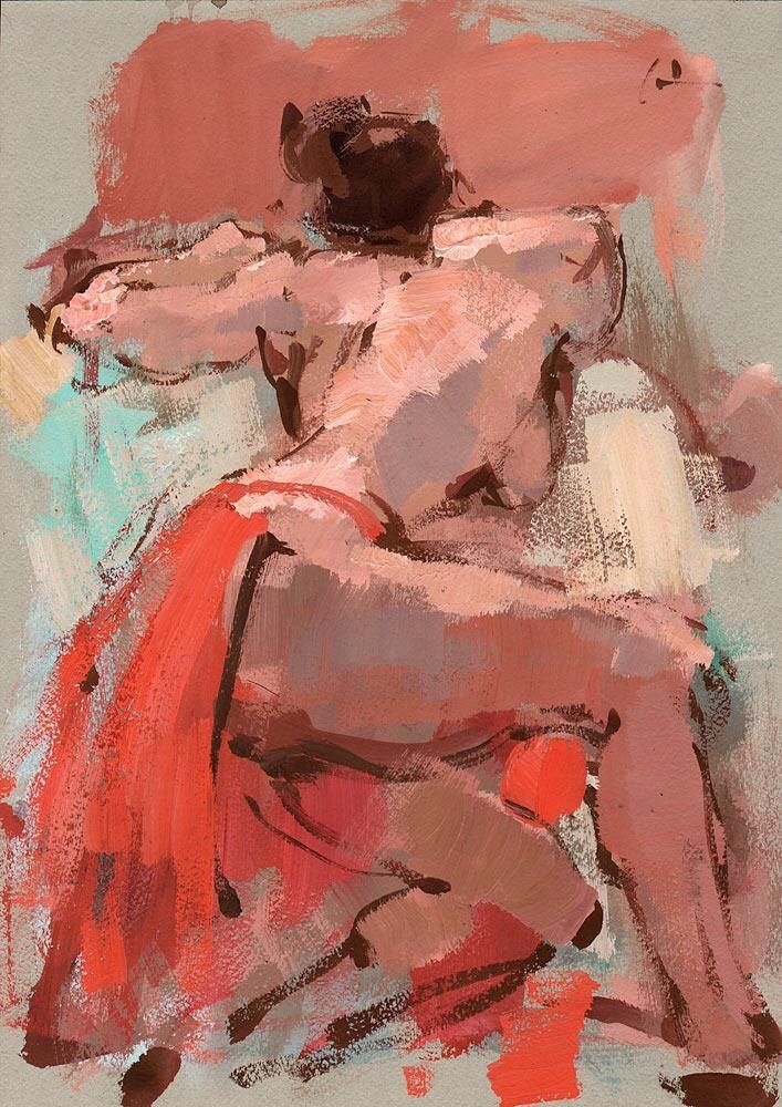
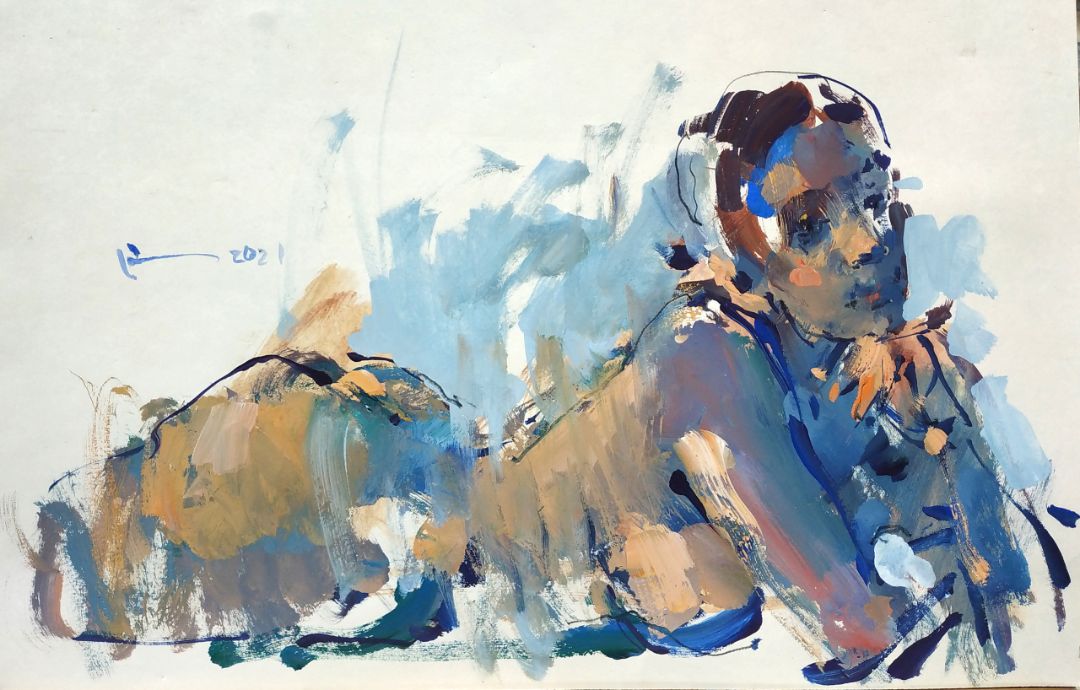
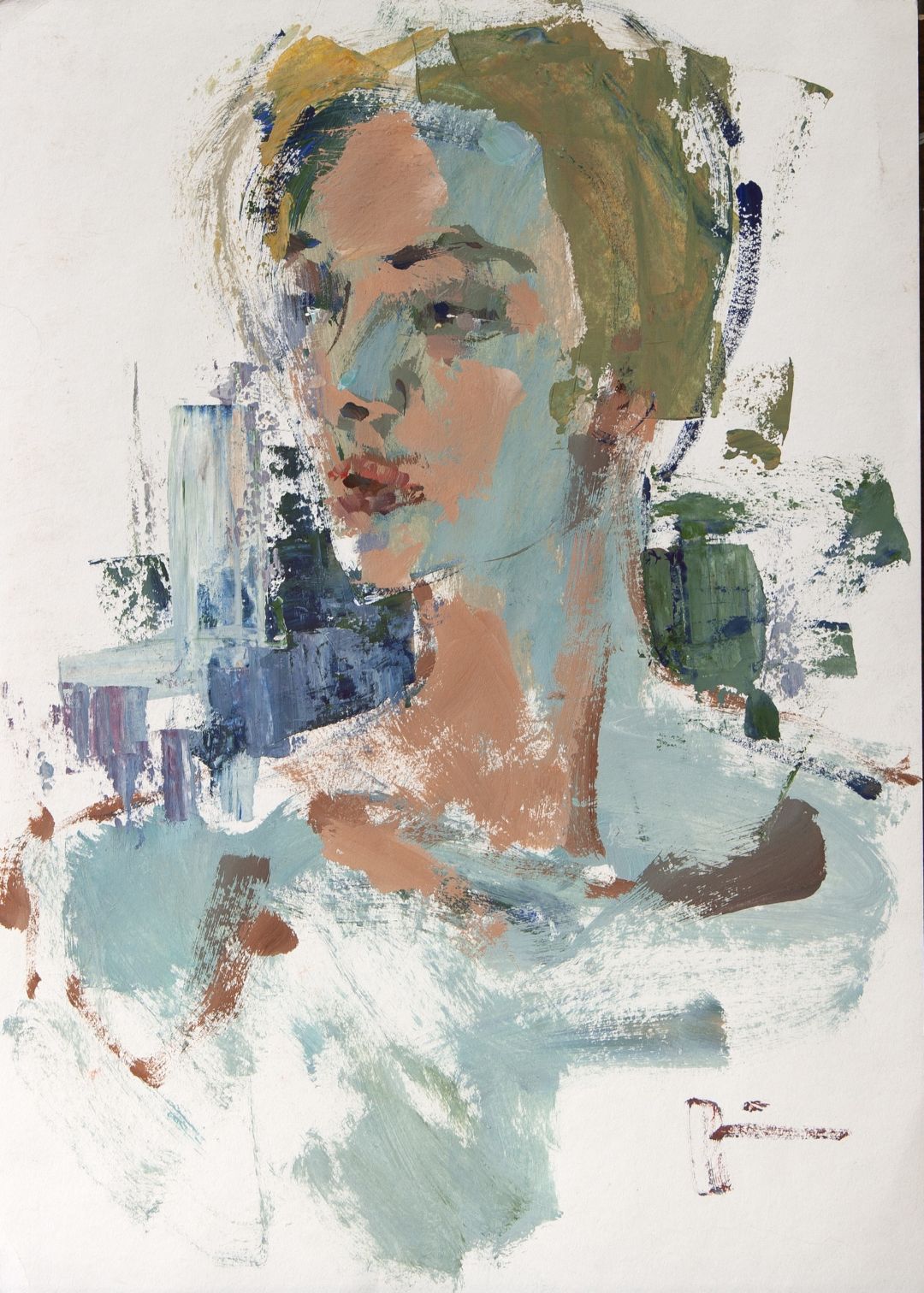
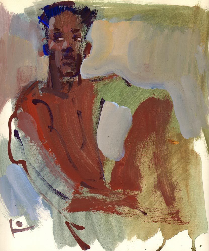
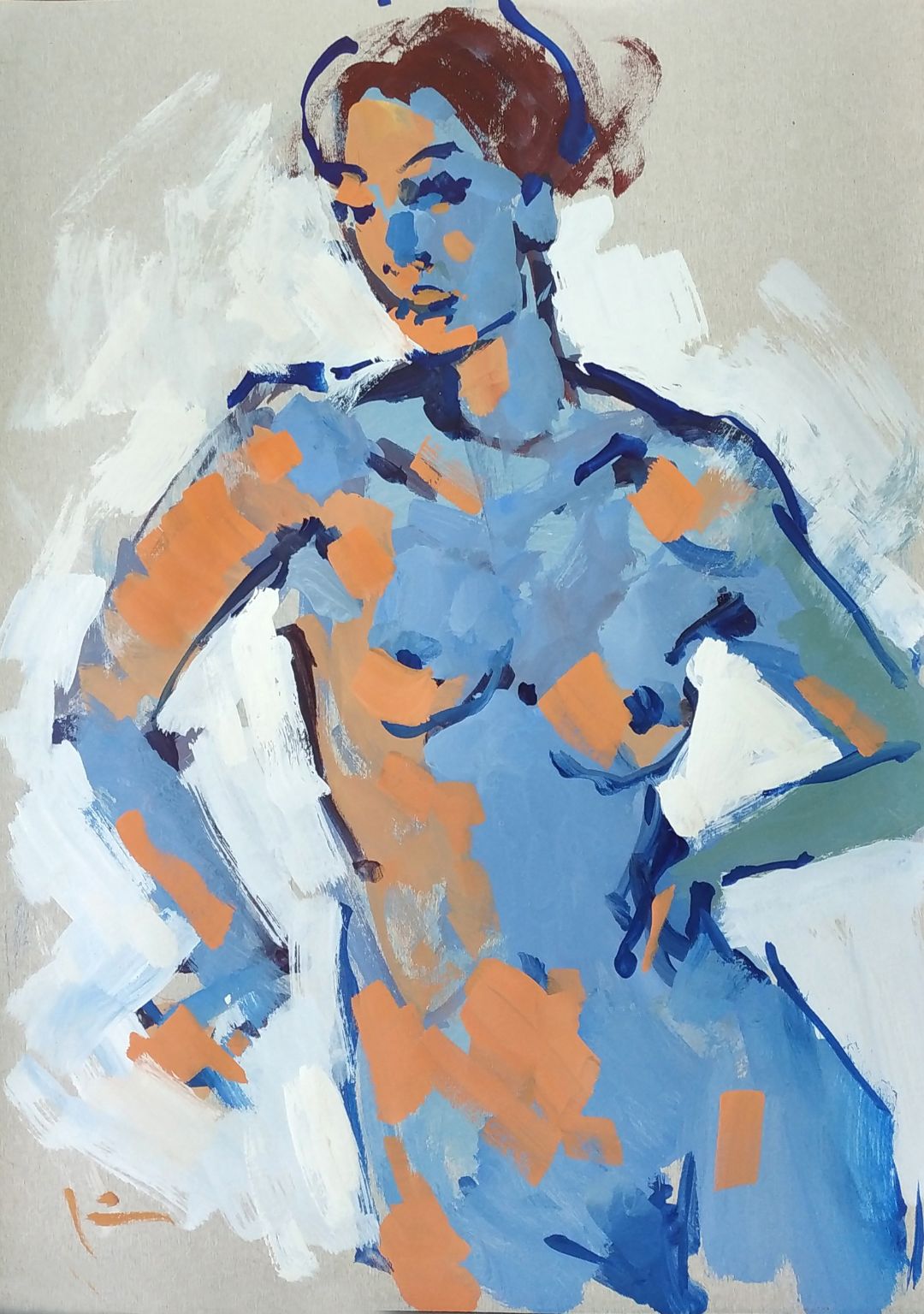
DESIGNER SKETCH IN TEMPERA
I don’t find copying interesting. Real light and colours are not so important to me. I like to find different solutions and discover unusual mixes when I freely use different colours, even from the tube. I consider design in painting as an absolute innovation, absolute freedom from what exists in reality.
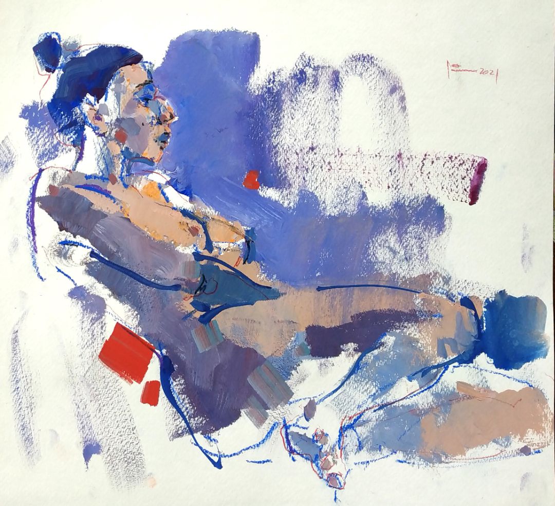
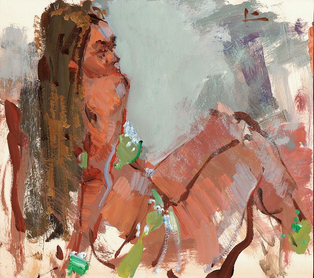
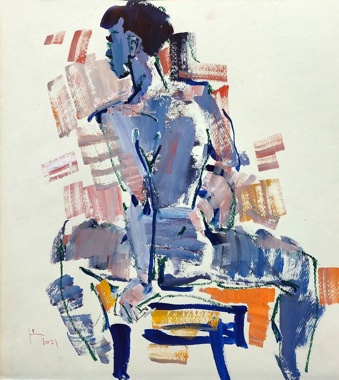
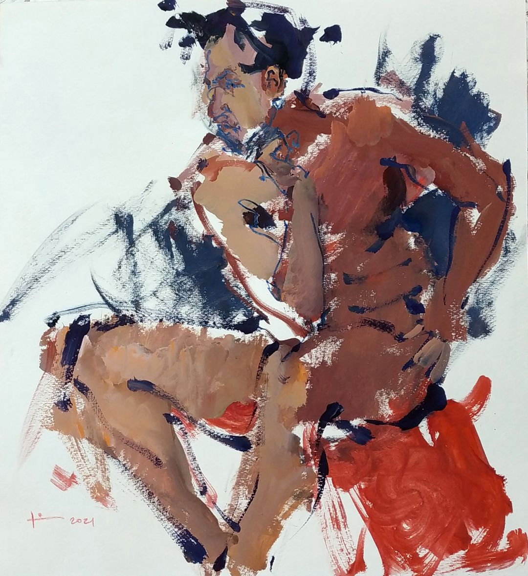
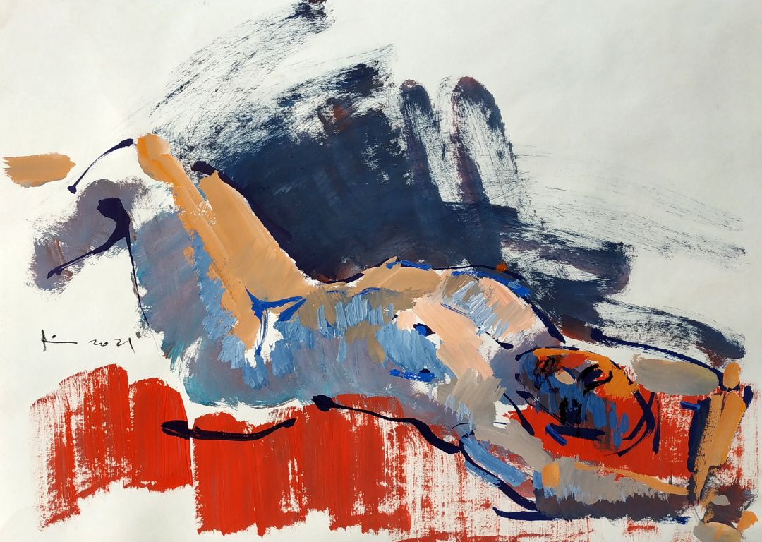
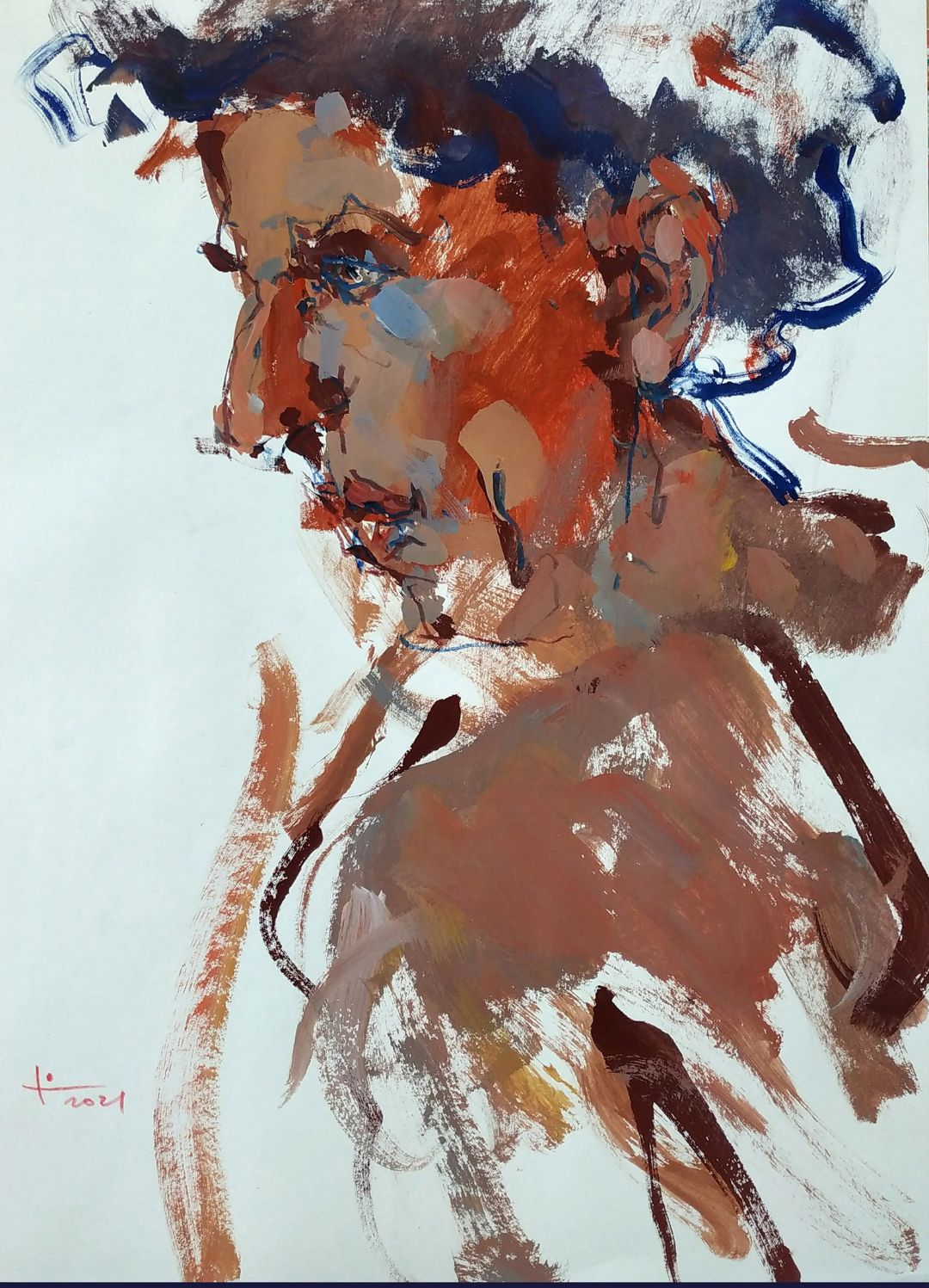
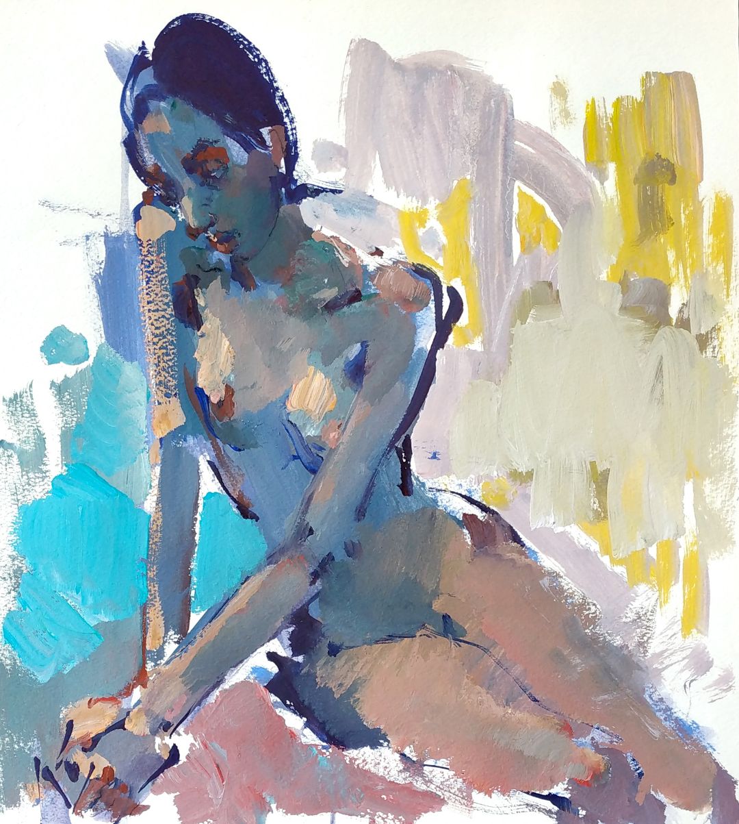
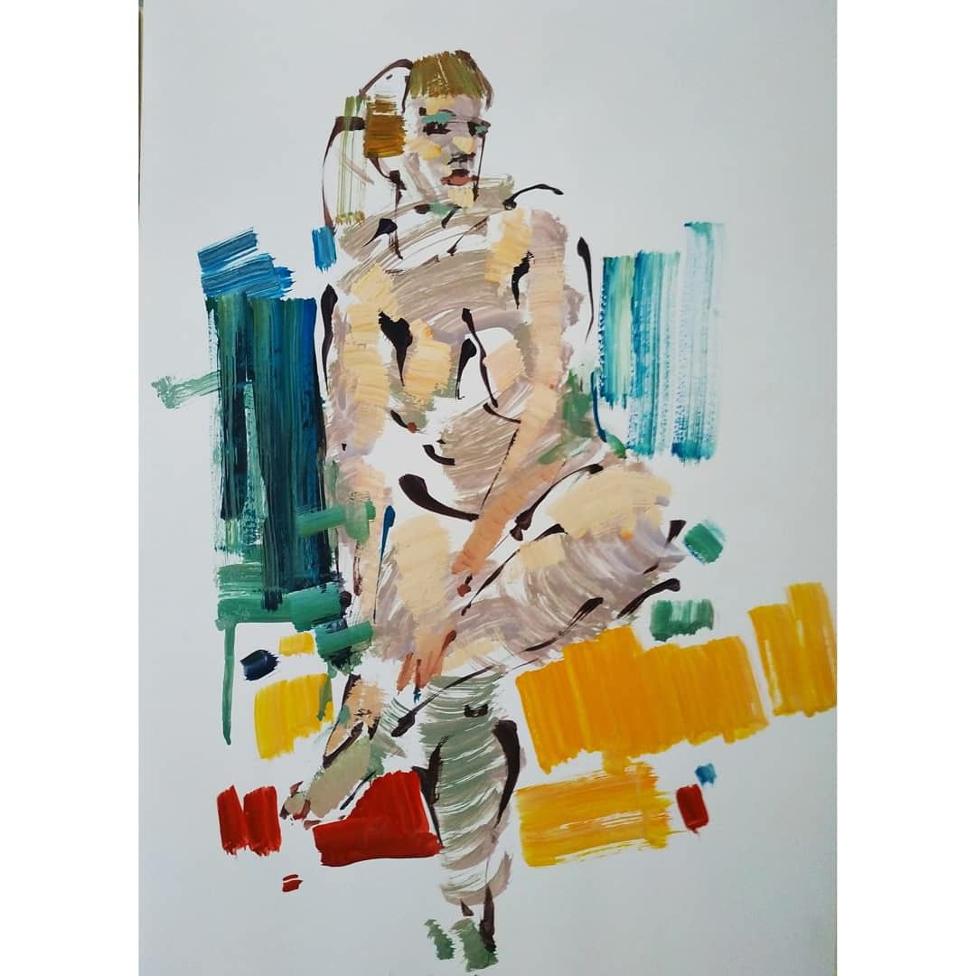
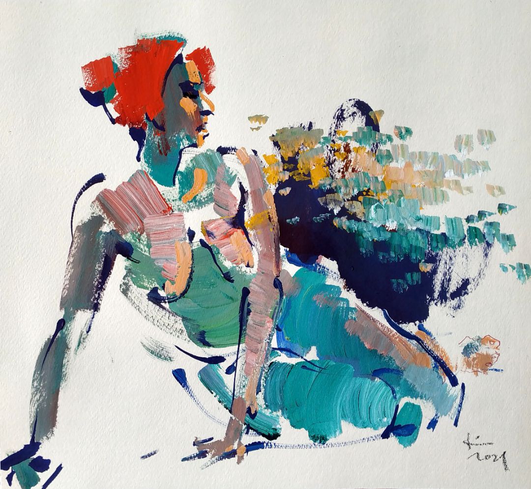
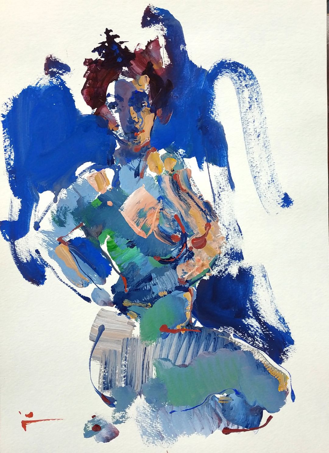
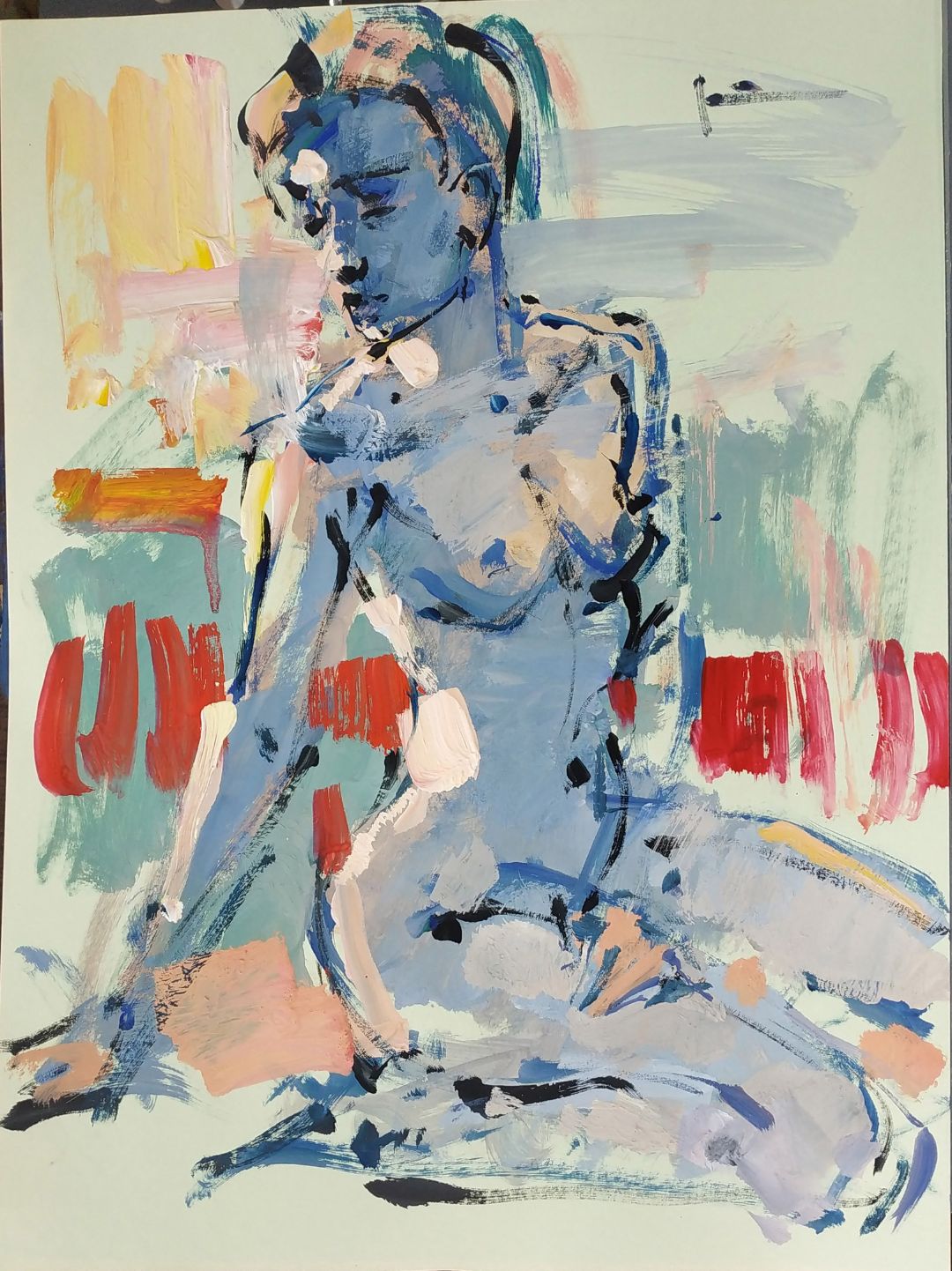
This is a new form, a new solution of what I see. I find it interesting to leave the fragments of blank white paper, make them the part of the composition, to make the game of spots, including white spots. It is important for me, to make a viewer feel this game and become a part of this game. It is transmitting of a feeling, transmitting of impression of what one sees. It can be a set of brushstrokes, or just any sports, in which you can guess a form or mood. Guessing is a key word, the key to the idea that every time you can look at the painting differently. Every time to refer to it as to something what can uncover over and over again. 

THE WORK ON A SKETCH.

While placing the figure on a sheet of paper, outlining a head, an angle of the hand, the thigh, I deal with big spots from the very beginning. I use bright blue colour for the surroundings of the model, I think that it is the blue that highlights the movement and the plastics of the model. The parts of the paper that were left blank are the part of the composition. I never know what I will get in the end, but I have a strong feeling that the set of these very spots will eventually form into a harmonious story. Having finished the work with composition, I use thin calligraphic brush to work on the outline and details of the figure. With a line I mark the outline of the figure in the environment. For this, I use dark blue colour: ultramarine and phthalocyanine blue. I paint with a colour, checking and correcting the proportions of the body. I improve the painting solution along with the sketch.

Instead of 10 minutes, I managed to do it in 5, because it seemed to me that everything is said in work, everything is interesting, and there is an intrigue and a life in this brevity and understatement. Try to use this approach for solving your tasks. But it’s very important to find the right moment to stop. I stopped when I felt that the work has already had life. I stopped, I finished the sketch.
THE SEARCH OF COLOUR SOLUTION IN A SKETCH OF A NUDE MODEL

I catch the colour and composition solution while I’m working, I never try to imagine the final image of the work in advance. Everytime I like to try new colour solutions of the middle tones. The middle tones in the work are shades and semi-tones. Any even the craziest colour solutions, any vivid imagination are possible in the middle tones. It’s a sketch, fast improvisation, that’s why you can experiment with different colours, unusual mixes. Initially, the middle tone in my sketches appears from the paint residue on the palette, some colours I add, make the first stroke, which directs the future development of all work. What will be in the background? Maybe, there will be nothing at all, just blank sheet, maybe there will be something, I understand this while I’m working.


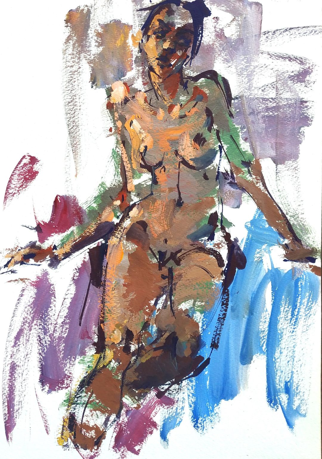
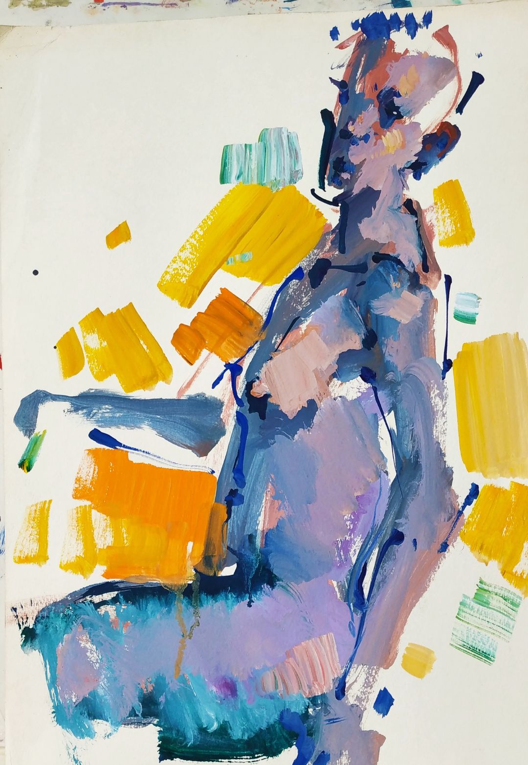
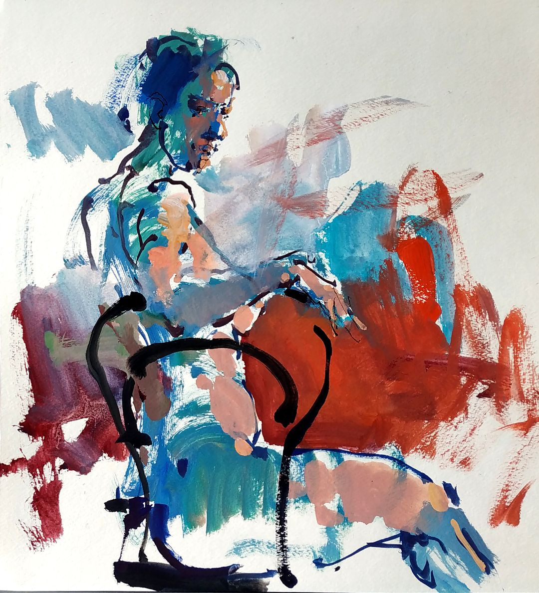
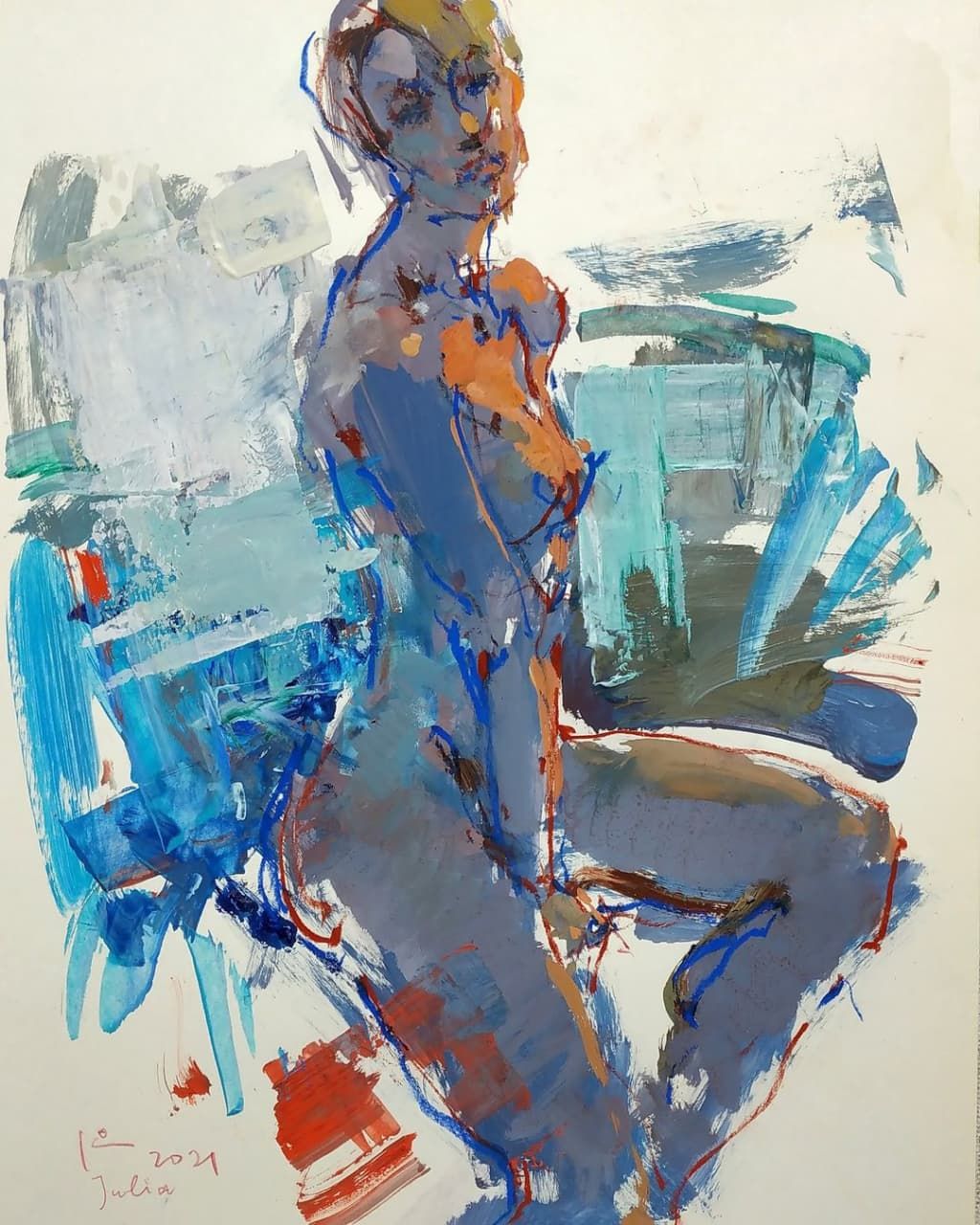
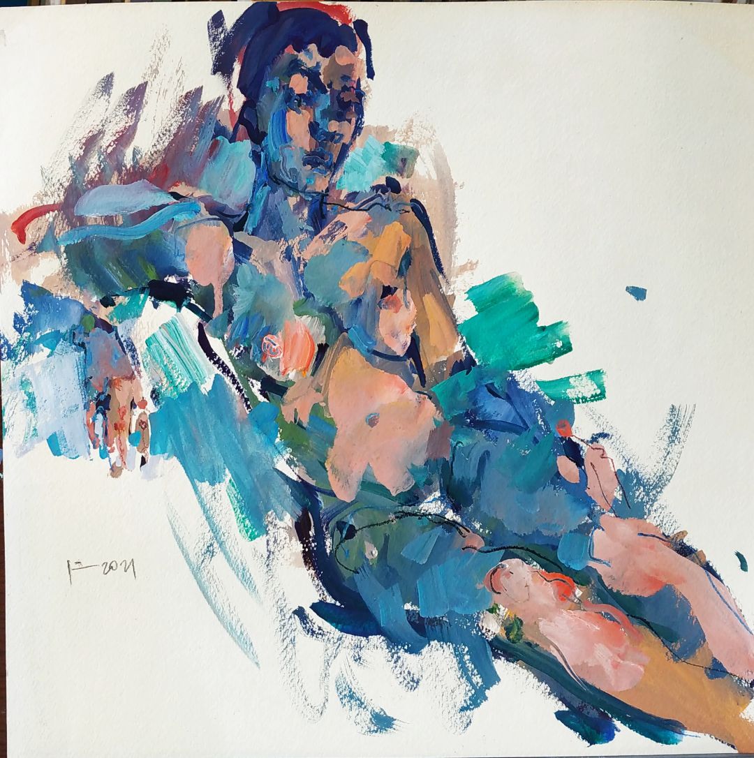
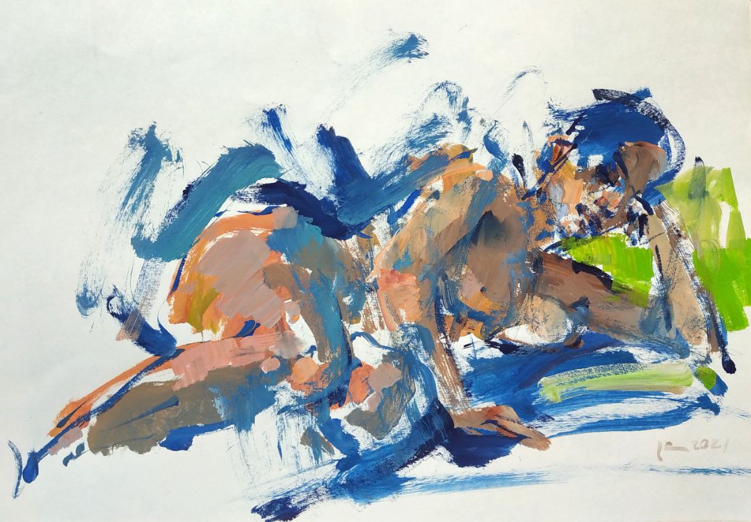
Adding a bright colour to the sketch, just having noticed a similar spot in my studio, I always intuitively check how the colour goes together with what I’ve already done. I listen to my gut feeling, how I want to make it: darker and more contrast or lighter and milder, increase the colour intensity or reduce. The development of the sketch can go any way. Much depends on the time remaining. I always set the timer, notice the time left and approximately count the things, I can make within the time left.  

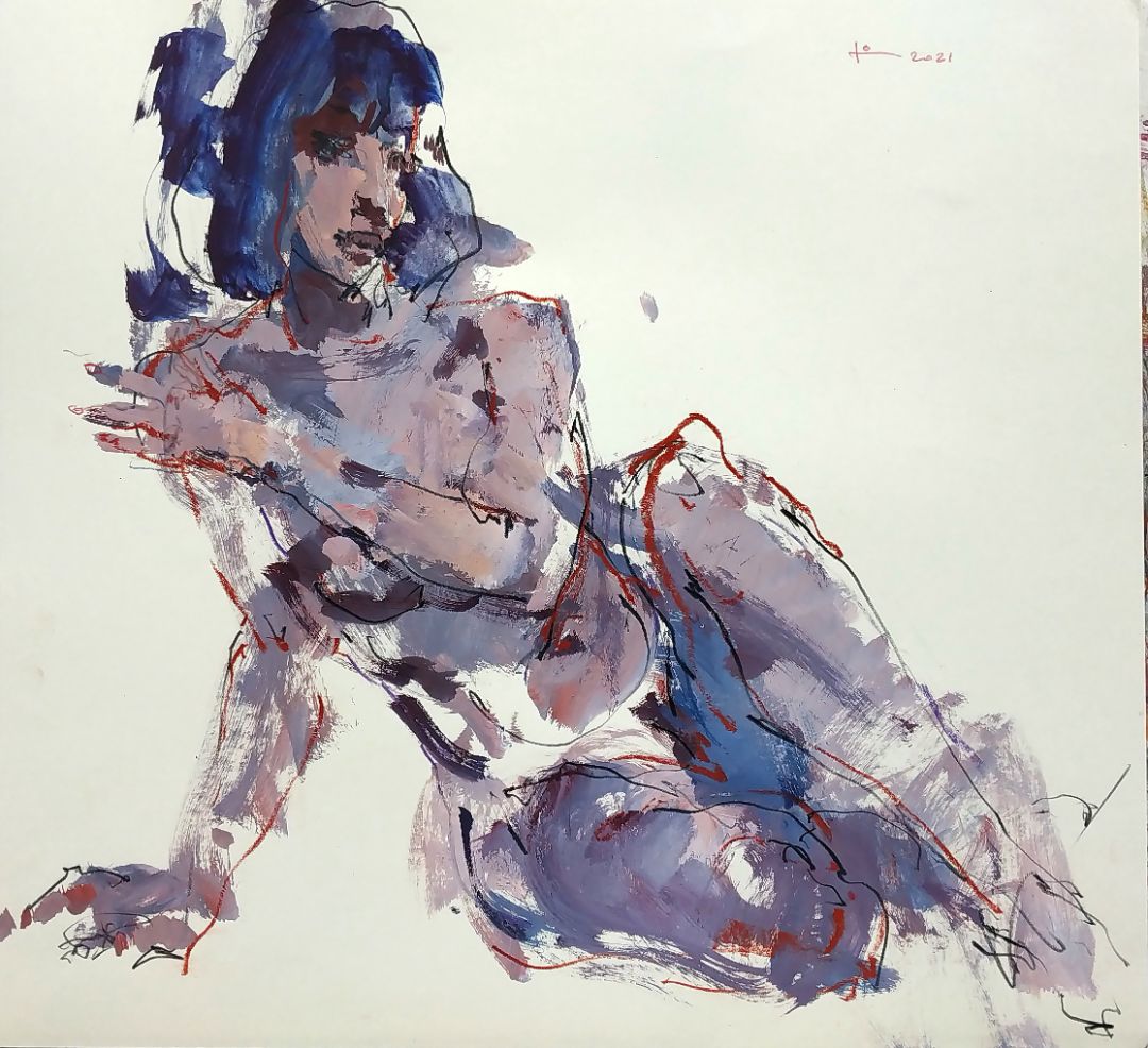
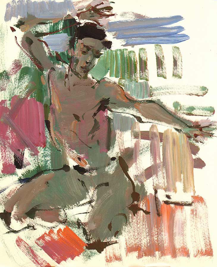
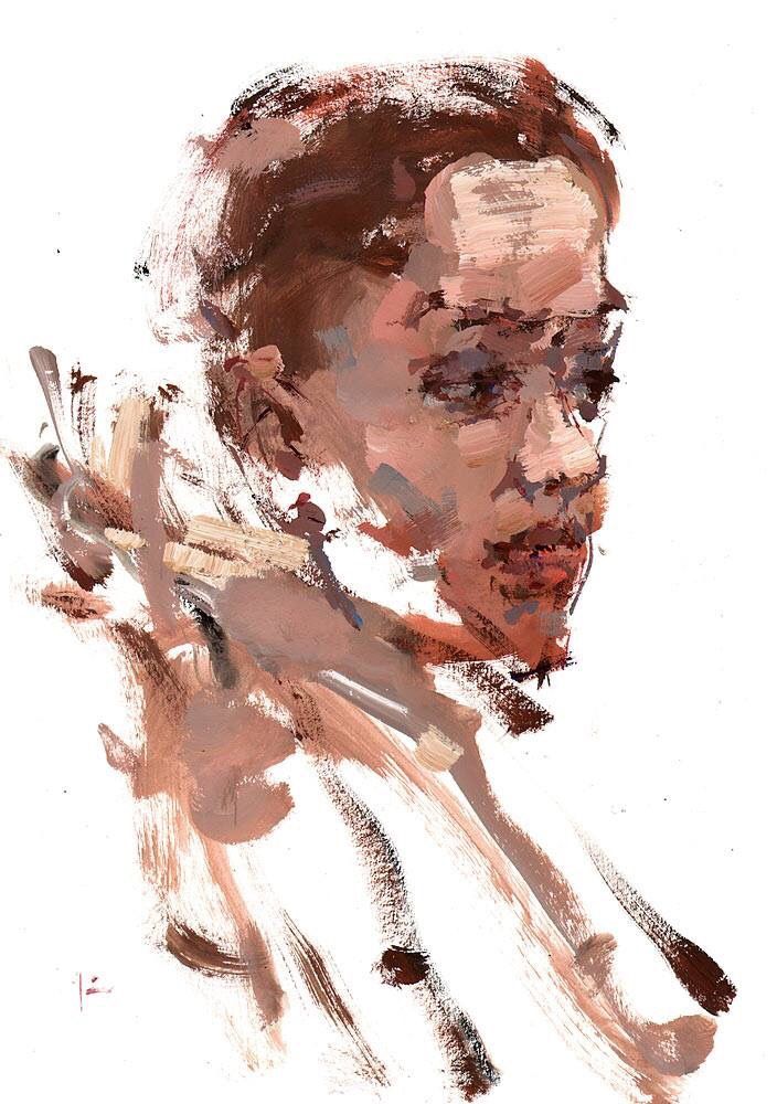
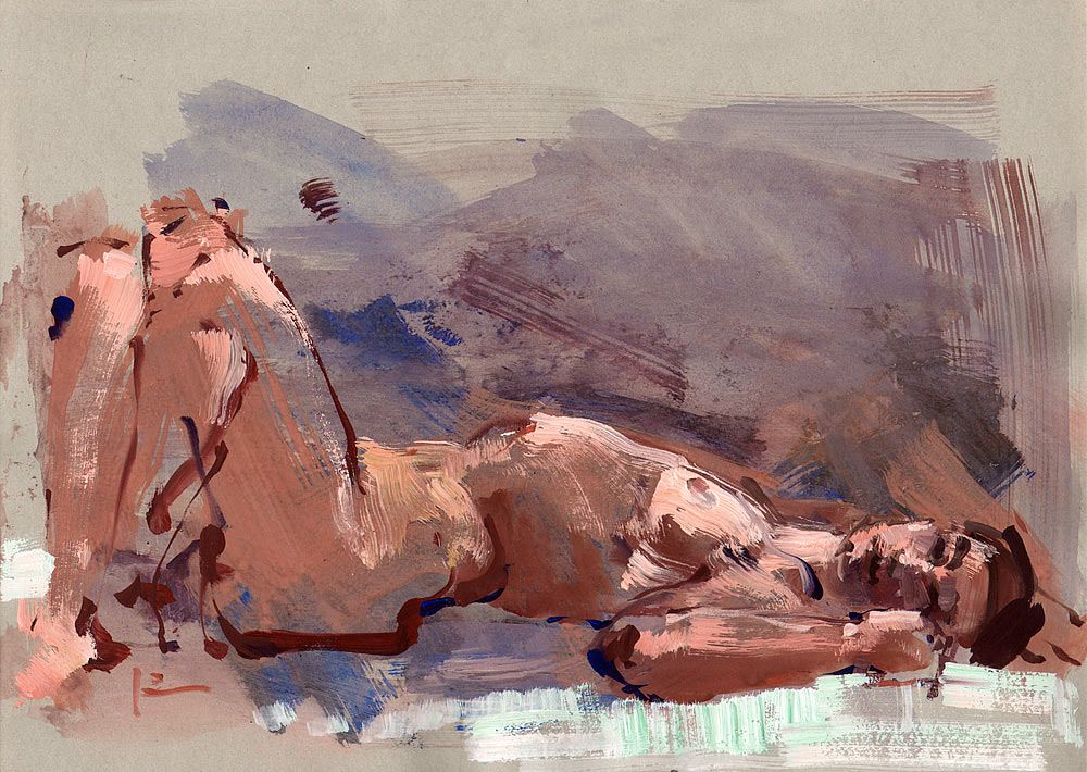
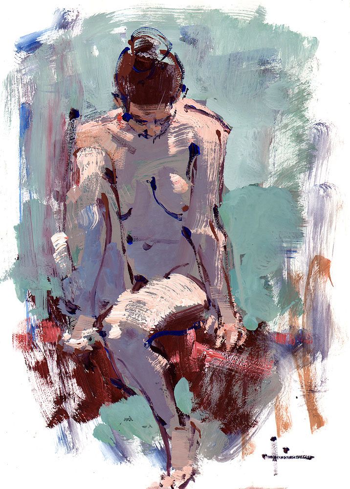
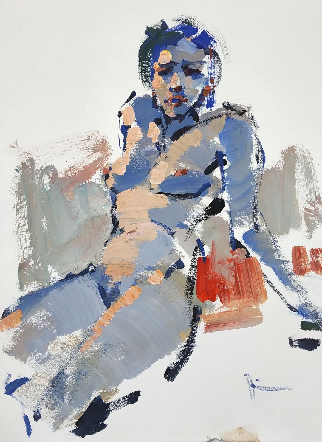
My advice is not to try to make everything. It’s better not to hurry, to work on less details, leaving the hints, but show the main plastics and the proportions of the body, the work of the form and the volume in the space, this is the main. It’s important to constantly refine the way the model is placed in the space, check, whether it is really the same positioning as in my sketch or I failed to fix the dynamics of the pose, I failed to depict the proportions precisely. It is also important to work on the beauty of the line, if you use the line as a tool for gaining expressivity. Try to make harder line more visible in some places, the weaker line in the others. Somewhere the line must disappear at all, and the light will work there.

With a line, I refine the outline and anatomy of the model. The background can go somewhere aside, this connects the background with the model. It is a pictorial technique. You don’t need to make the line go exactly on the form and finish there, where the form finishes. Let the line go beyond the form. This way the line becomes vivid, it is always really interesting and expressively.  
THE WORK ON A SKETCH.

At first, I outline the main volumes. I’ve outlined, where I will have a hip and a thigh, where I will have a knee. I give the middle tone, you can use any colour, the direction of the strokes is given by the direction of the form.

Everytime I keep the feeling of the size of the sheet, to place the figure the way I want, the way I find it more expressive. You don’t need to place all the details, fingers, toes, sometimes even a head. It’s always possible, but sometimes I want to paint a sketch using a fragment. The colour of the hair is not important for me because this is a search for a solution, it is a fantasy of colour.

Despite the warm lighting in reality, with the cold tone I try to show the light, which falls on the face, arms and the chest of the model. A bit later, I will work on it a little, but at this stage, I find this decision right.

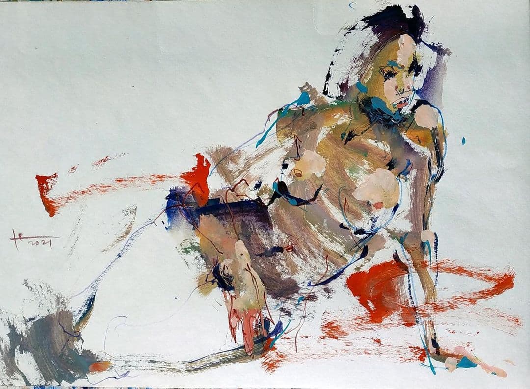
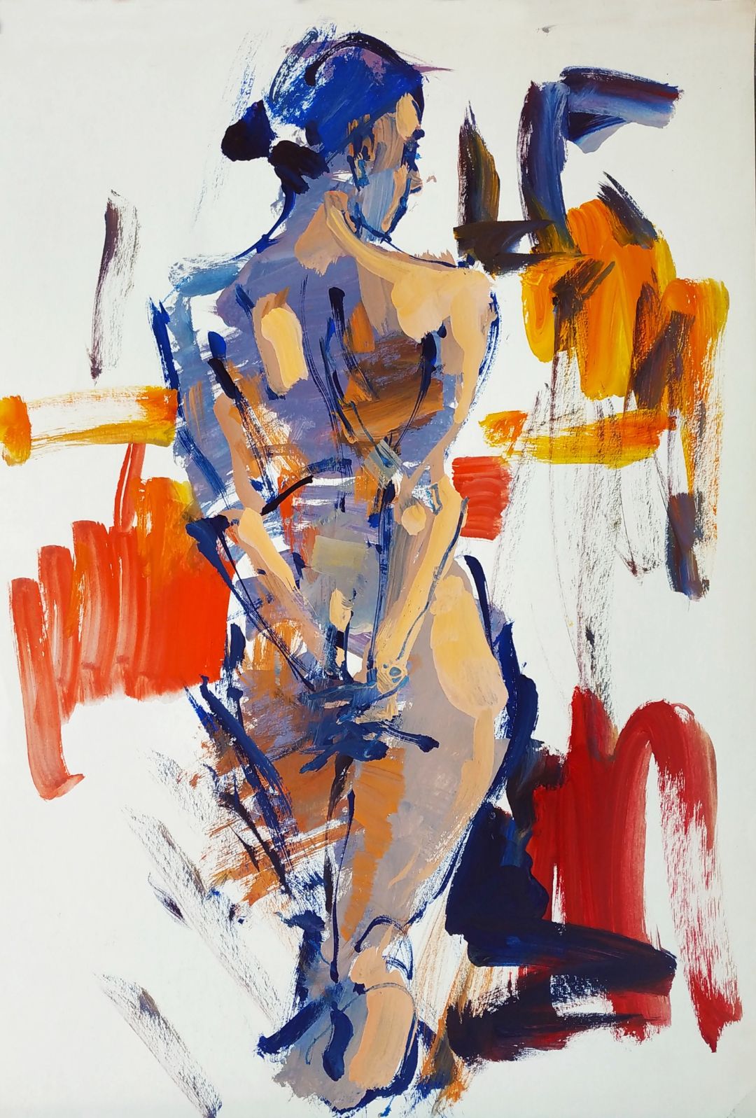
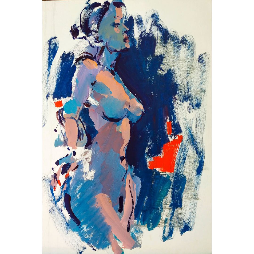
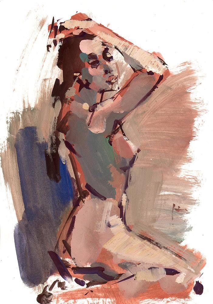
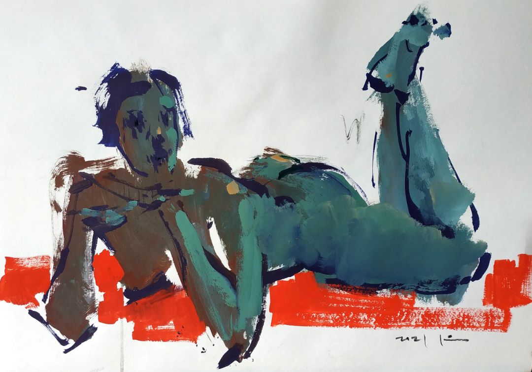
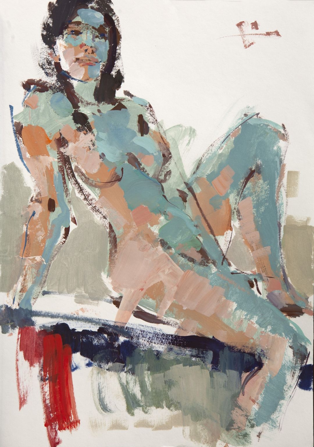
I saw the red cushion near the model and make some bright strokes, this is the solution for the background. When the main colour spots are made, you can take a thin brush and work out outlines with the line. The line can cross the colour spots, that’s the beauty of painting. The line of the shoulder blades, a chest, a thigh is highlighted more. A calligraphic brush let you with different pressure make the line of a different width. Somewhere the blank sheet is left. I like it when a part of blank sheet is left and this works as a part of the composition.

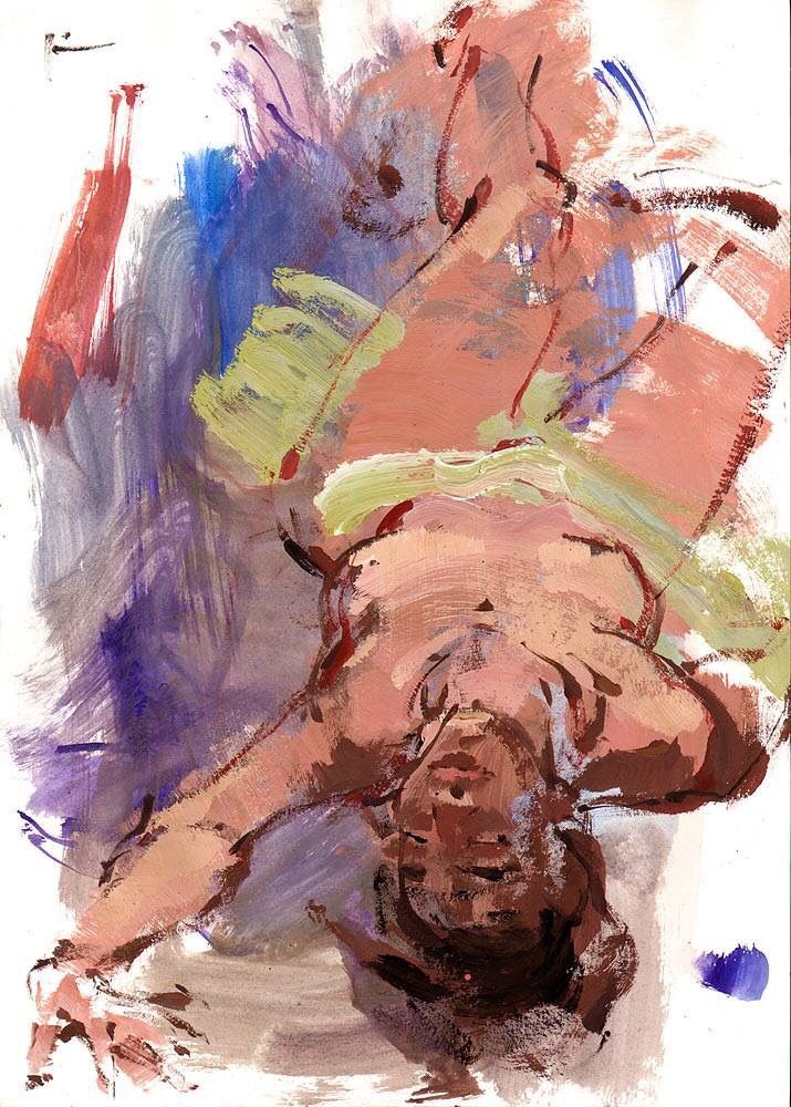
In my opinion, we just need to underline the light. The work can be finished any time. In technique, that I’ve offered you, the main idea is not to overdo, the light must be very laconic, if you overdo, you can spoil the simplicity of such solution. I add the warm colour, which contrasts with cold semi-tones, and that’s fascinating by itself. Such technique can be used in landscape, still life and in any genres, it can be used by those, who study drawing. The drawing is the base of the pictorial art, you have to master this skill, I strongly recommend to study it properly.  
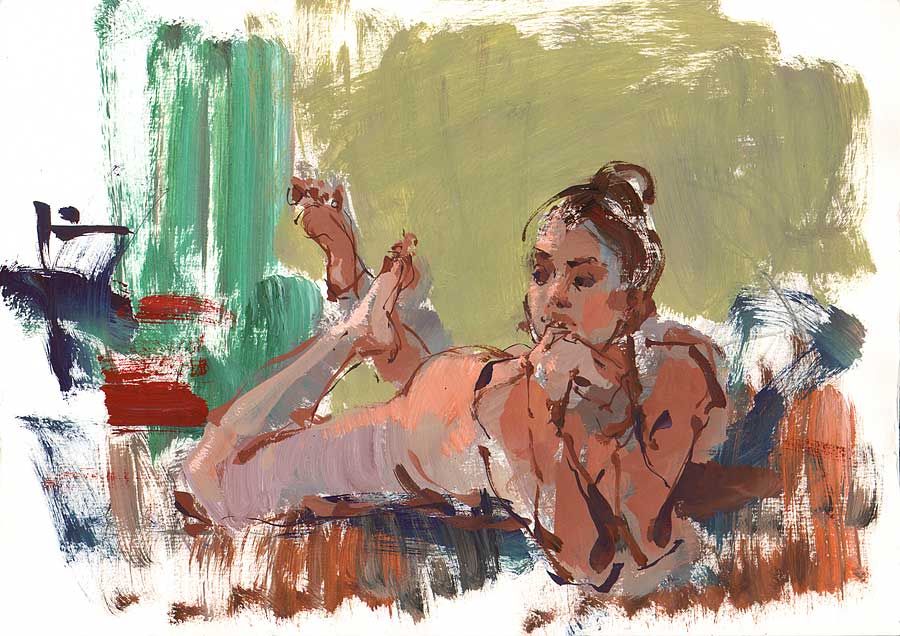
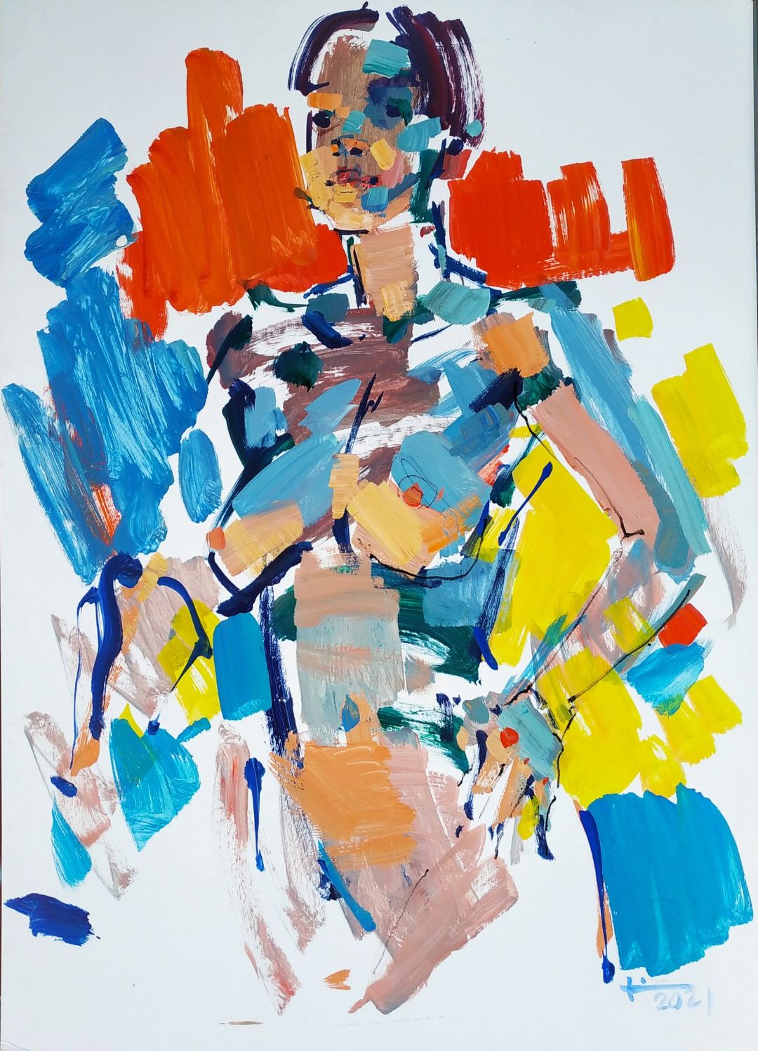
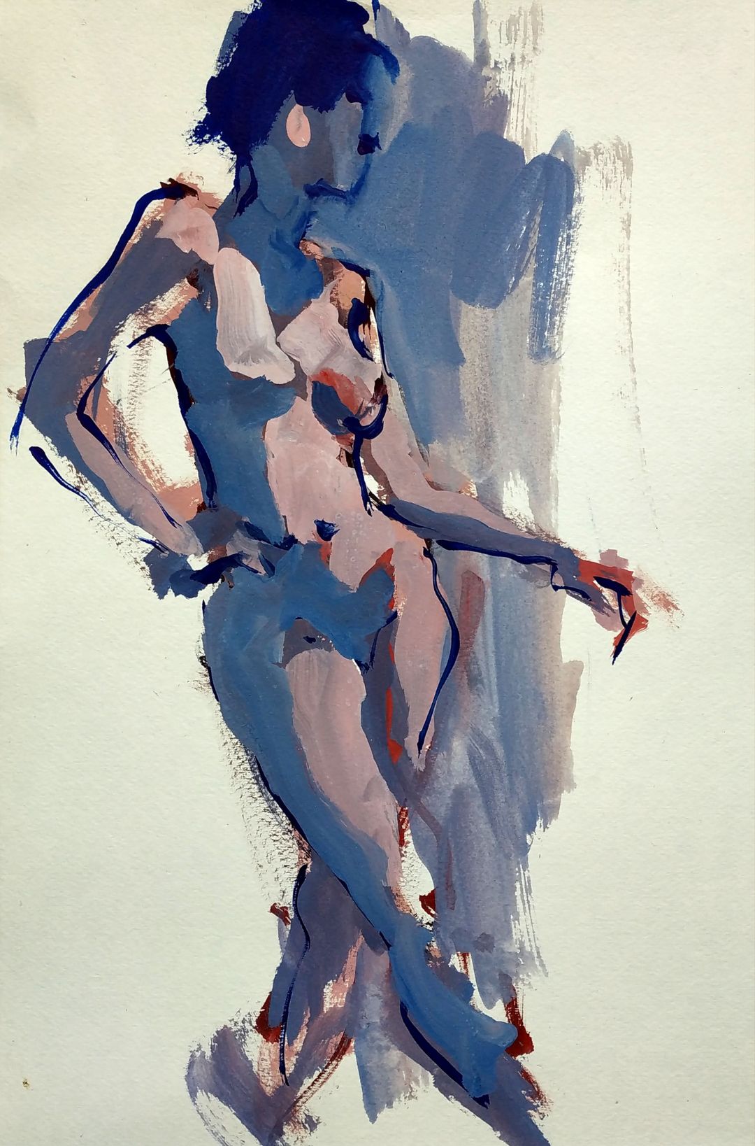
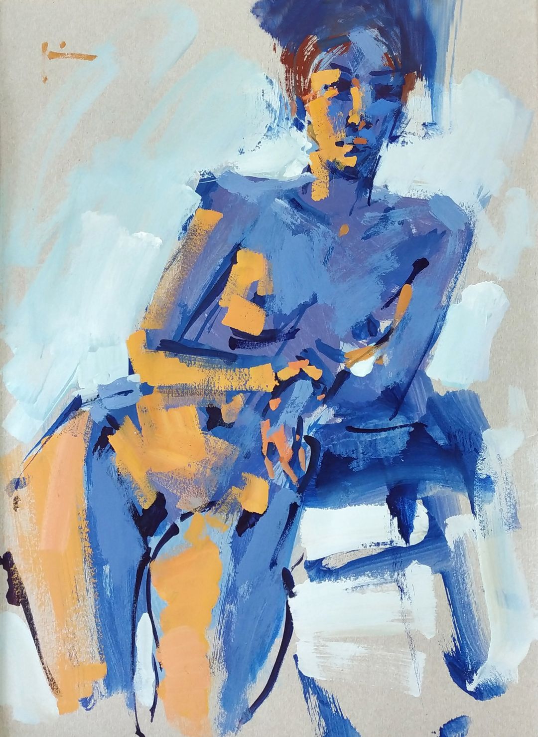
TO CREATE A COLOUR.
Why do I practice pictorial sketches of a nude model? Because it’s difficult, when you have learnt to depict a nude model in any poses, you are able to paint anything.  At first, I lay out the sheet. I understand, that, at the margin of the sheet I can put an arm and a hand, there will be red textile, a shoulder, along here will be a chest and a stomach. I use the colours that I have in my palette. They are of shocking colour tones sometimes. The blue legs may seem strange, but they are in the shade, and to the middle tone of the body I chose, as I see this, designer solution. The side lighting of the figure I make with a warm colour.  I paint the main volumes of the form with concise color spots, the things, I want to focus the attention on. Not everything I want to depict in details. This very reluctance prompts us to find new solutions every time. In fact, that’s what we call feelings. I draw what I feel, following this feeling. 

I use a flat medium-sized synthetic brush. A real tone and colour do not matter to me, it’s a free fantasy solution. The bigger part of a body can be made by any colour and be lit by the light of any temperature, for this sketch I choose blue-green tones. A thin calligraphic brush allows to work on details and give the direction to the eyes, to catch and depict the slight tilt of the head. I refine the drawing of the head directly over the background. A sketch is a constant refinement. That’s the beauty of it. At first, you can just slightly give a hint of the line, and then you can highlight it in bold, having caught the precise proportions. It is possible to make the line harder, where it is needed, or somewhere you just don’t need it.

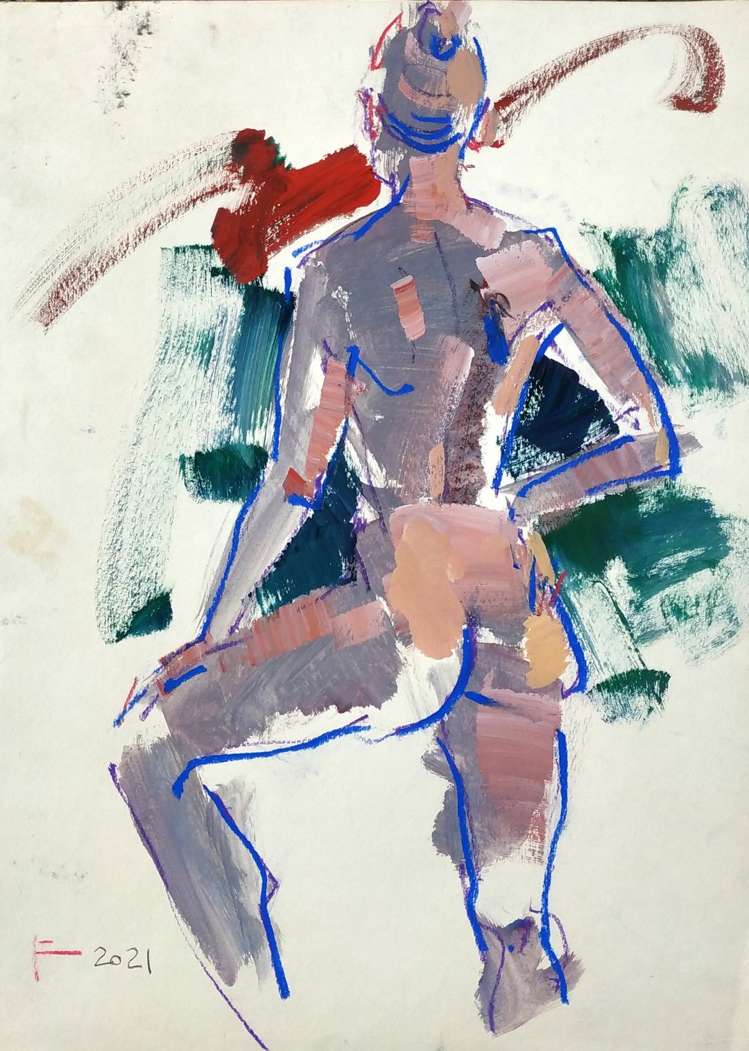
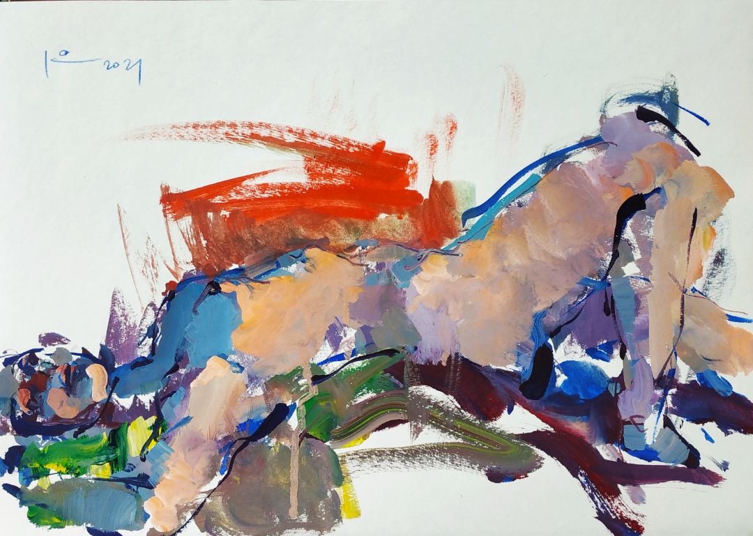
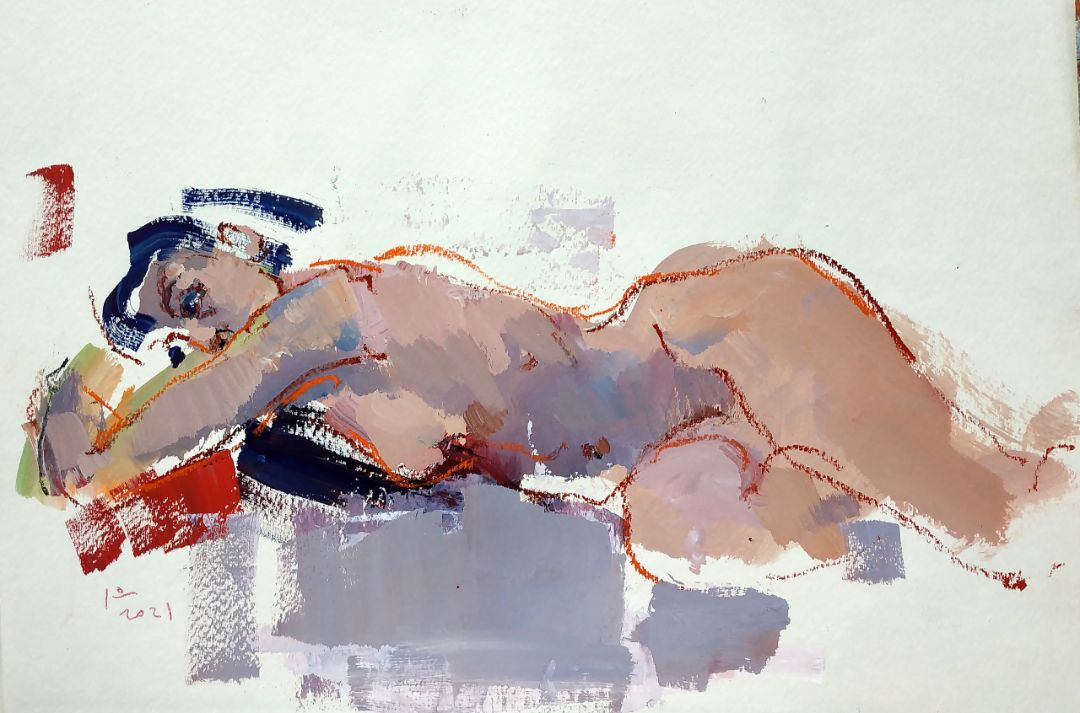
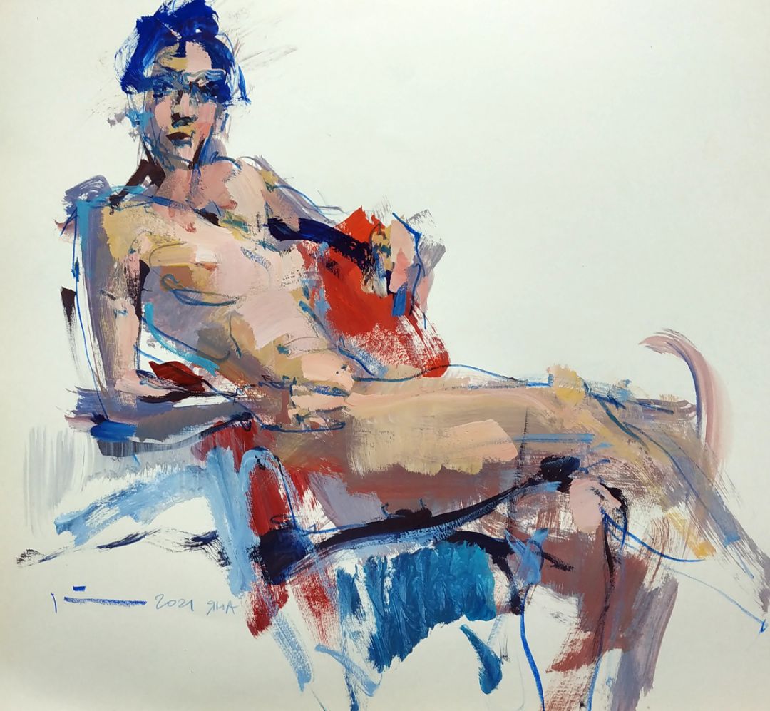
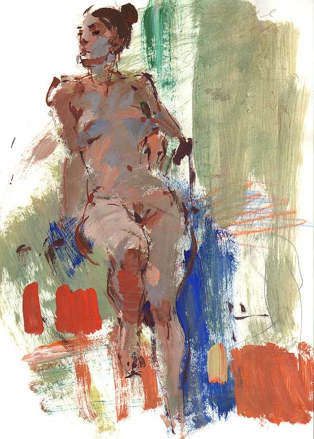
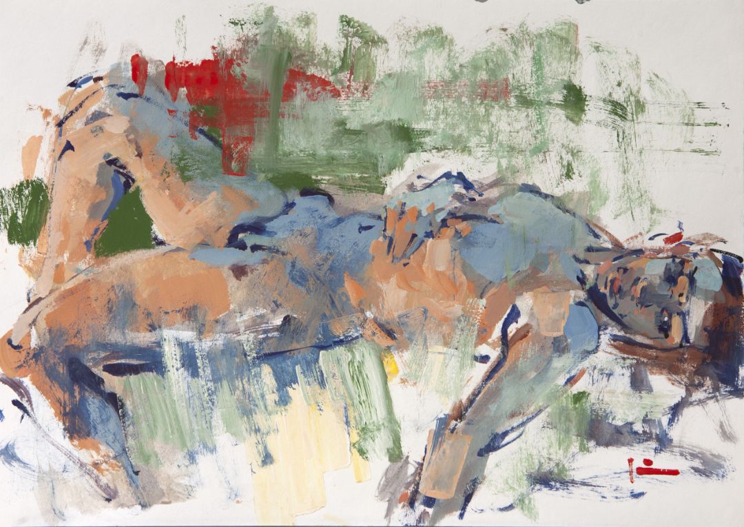
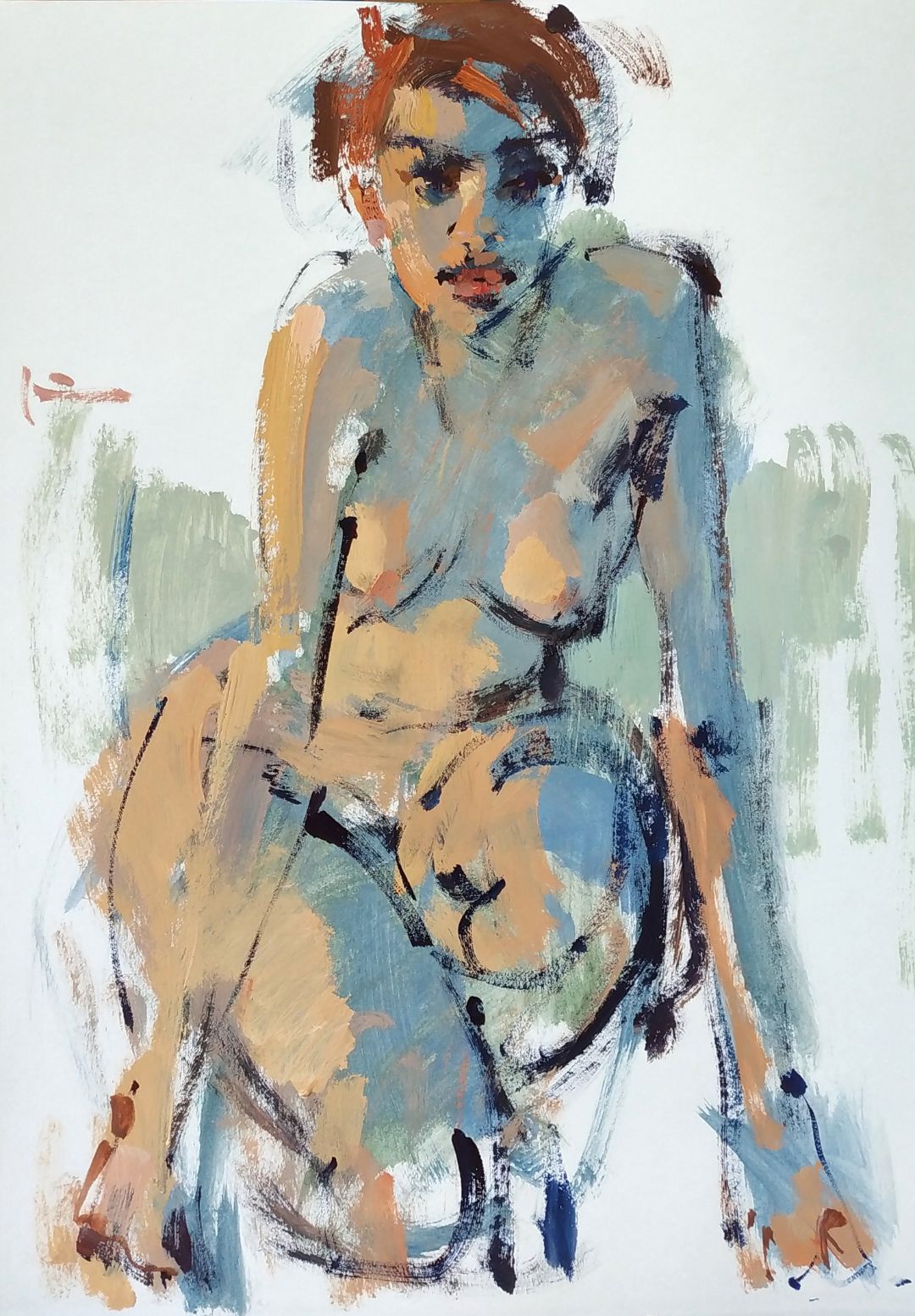
The red textile in my sketch is the composition on the red what I see. Actually, it is of a very sober colour. However, I find it interesting to experiment on such colourful mixes, especially when the red and greenish tones go together very well.

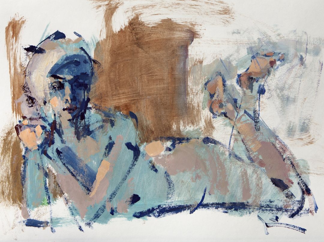
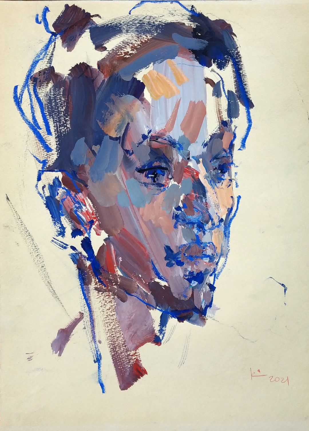
I use the warm ochre colour for the lit parts of the body. Somewhere I add yellow, somewhere white or red. You can use different tones, the are all close together.
it is important to show that the light on the chest, face and hand is different. I don’t think it’s necessary to count all the light spots, I only underline the main, the ones that form the composition. I create my own colour solution.  

A SKETCH OF A MODEL WITH TEMPERA OVER THE SPOT.

I find the work on sketches very important, it’s like the element of constant training. You have to keep yourself in shape all the time and always improve in drawing. Of course, if your goal is to turn every sketch of yours into a masterpiece, there is nothing more interesting and more simple as people are always around you, you can draw all the time. You don’t have to draw a nude body, but the nude body is plastics, beauty and specificity. Clothes often hides vital points of the body, while you can see everything in a nude body and you want to work with such plastics. I find it interesting to hold on to model’s shape and find the unique features of this particular model.

If there is no possibility to draw a nude model, try to work with still lives or landscapes. Make sketches, look for compositional decisions, find yourself in colour, get a taste of depicting something simple. Get different expressions on simple forms, this is very important for your growth. 

THE WORK ON A SKETCH.

When I start working on a sketch, I look at the setting in general, I try to focus on seeing the big spots. You can lose a lot, if you go into details at the first stage, not compiling basic volumes. This method takes a little more than a minute and let you to uncover a blank sheet, set the average tone to the work, fix the model’s pose in space and set the proportions.

Then, I refine the form using a thin brush and dark colour. The blank sheet that remains unfinished doesn’t bother me. It becomes the part of the body with earlier prepared spots. I refine the proportions with the line, draw the details, highlight the elegance of the model’s pose. Even in this state a sketch can be called finished. It is important to ensure that the work looks complete at any stage, to make any spot or line to look harmonious. I like such laconic works.

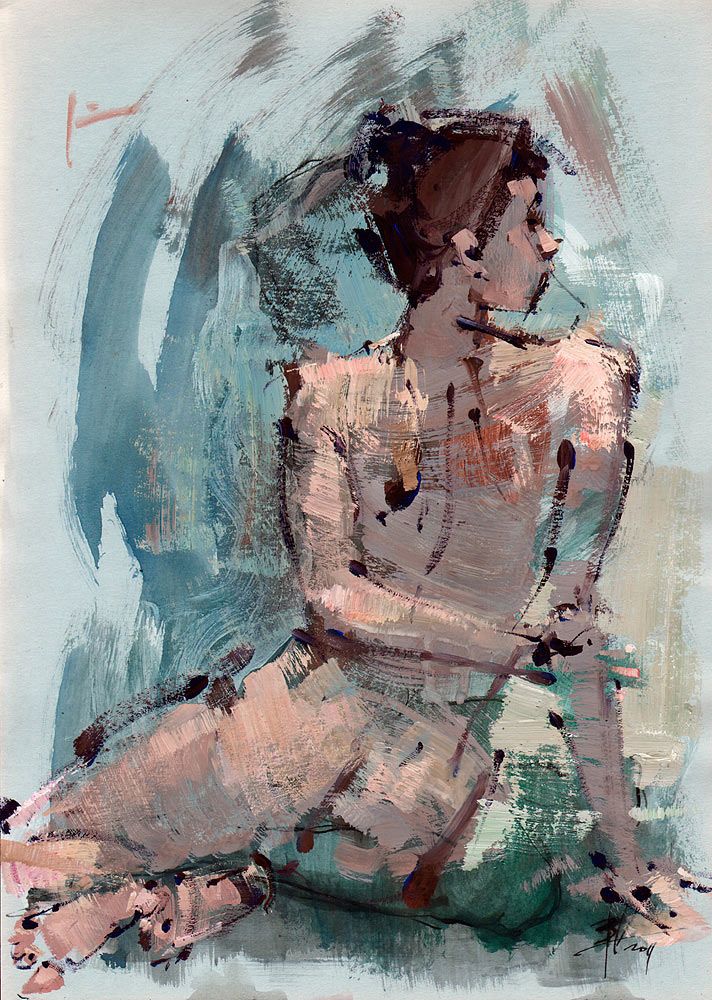
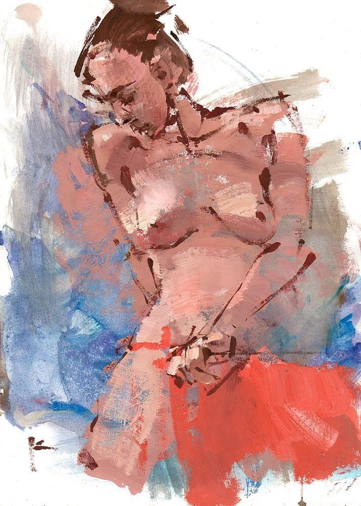
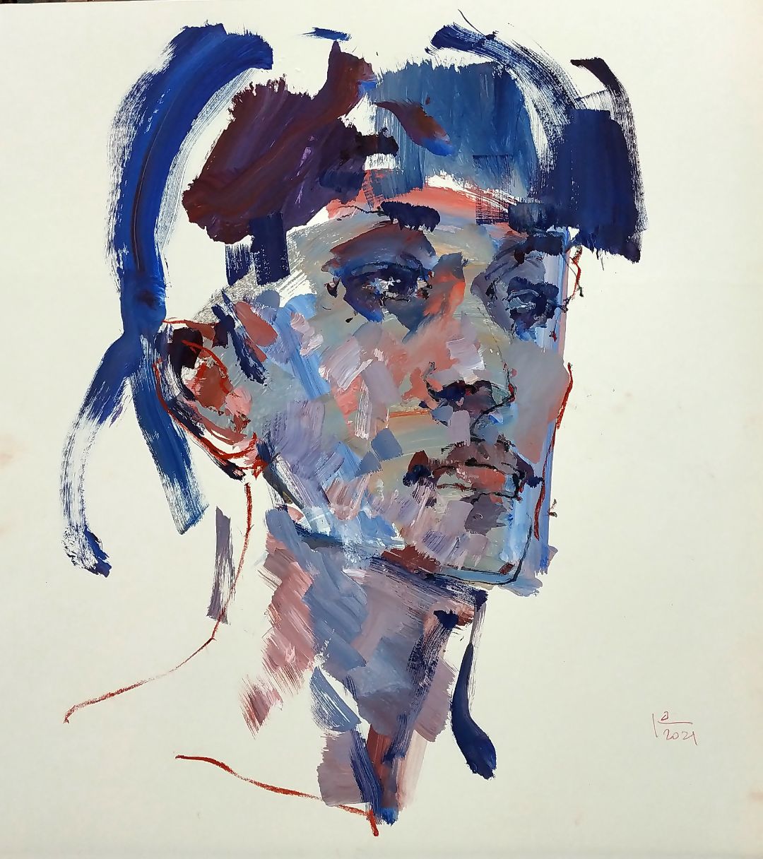
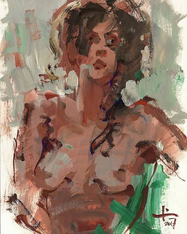
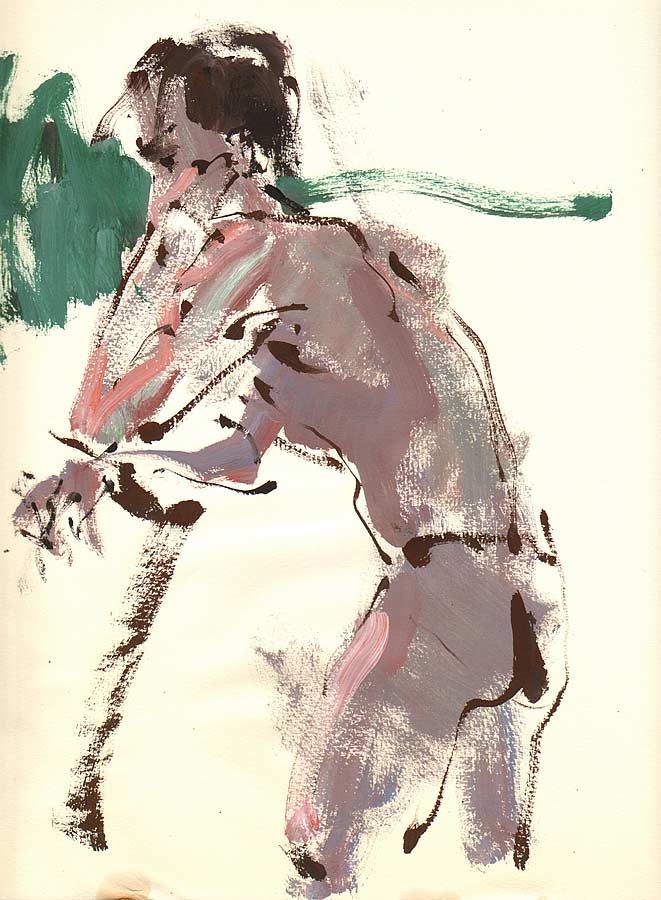
 It turns out that even such a quick sketch turns into a work of art. At some point, I feel like I need to stop. Of course, you can continue to refine and finish, but sometimes the magic finishes when you go on refining. You lose dynamic, freshness and expressiveness. The power and beauty are in simplicity. I’m for simplicity. I encourage you to sketch as often as possible. Sketches are the quintessence of what you can do. 

EVERY ARTISTS IS A DESIGNER.

I think that every artist is a designer. While setting a still life, an artist selects and arranges the objects so that they all harmonize with each other and the background, and on the plain air chooses the best angle, illumination and time of day.

On the other hand, if every angle is unique, why there are a lot of similar compositional solutions. To arrange the objects in a still life and choose the point to start working is the beginning. What to do next with all these? How to arrange the composition, find the solution that will be different from your neighbour’s still life, different from the solutions of the artists you know. How to create the work, to make it different from others, but also different from your own works?

Your own works, your technique you always know the best of all and again you need to paint in a new way, it’s really hard not to repeat yourself. I can think of Claude Monet with his series The Rouen Cathedral. Almost the same composition, but dozens of different colour solutions, colour approaches. In my opinion, this is one of the best examples of continuous and persistent artist’s search, his movements towards a design solution. He didn’t paint literally, he didn’t copy the colours he saw, he solved them. He was looking for interactions, unexpected interactions, creative ones. 

Isn’t this the beauty of painting to find each time a new creative solution to the same motive? 


CRM-форма появится здесь